Promotion description, PIF and price
Last edited: 28/09/2018
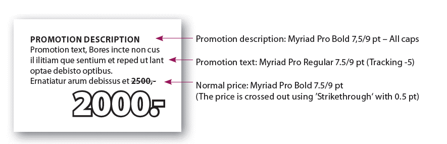
PIF and Price
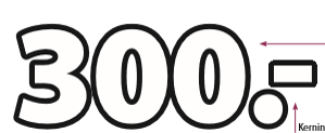
Remember to space the numbers and the decimal separator closely.
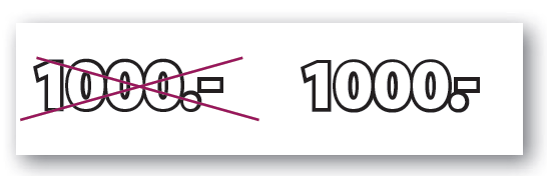
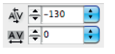
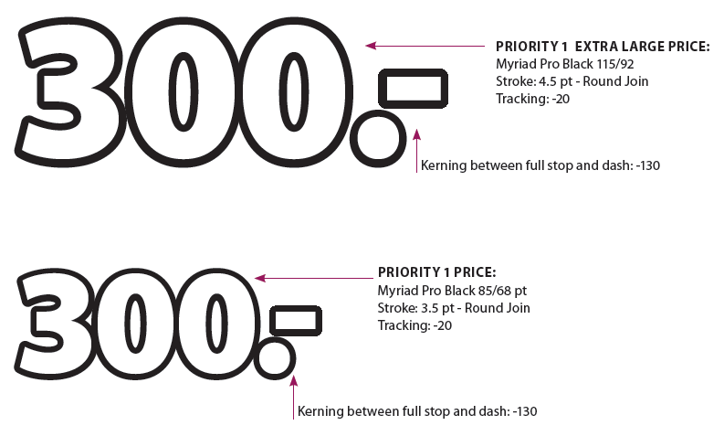
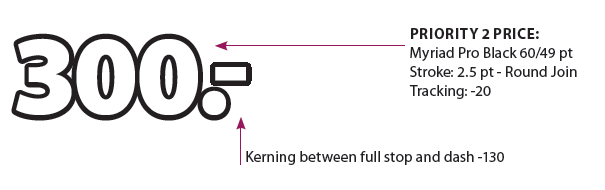
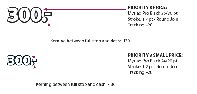
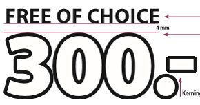
Set the cursor between the full stop and the line and pull the same with -130.
Placement of PIF, Price and Promotion Text
Whenever possible, consistency in the layout should be prioritized across the spread.
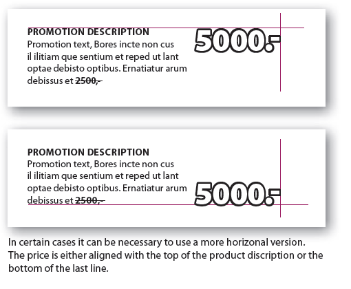
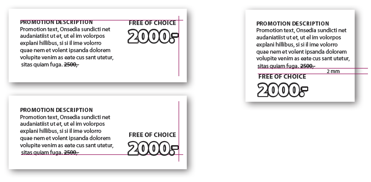
- Alignment of price and promotion description
-
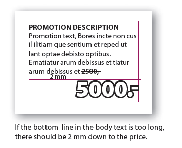
- Price when body text is too long
-
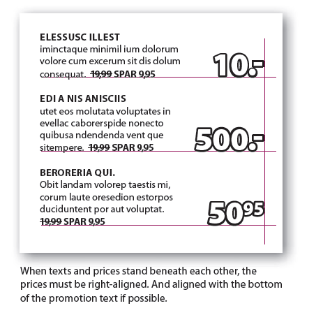
- Texts and prices beneath each other
-
- Price above product text
-
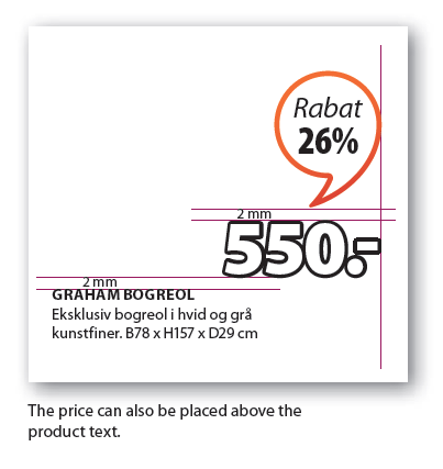
- PIF should always be above price
-
Price info front is always placed above the price.
Currency descriptions
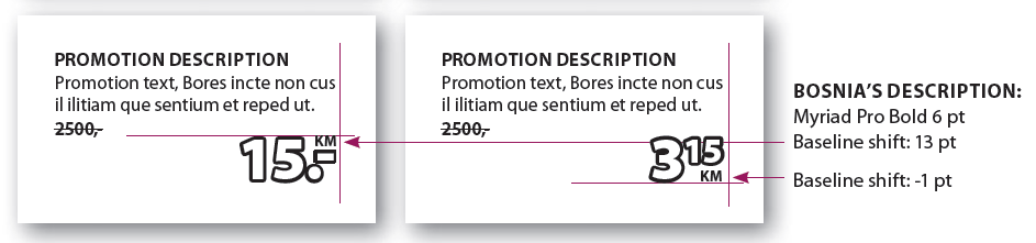
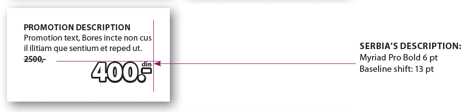
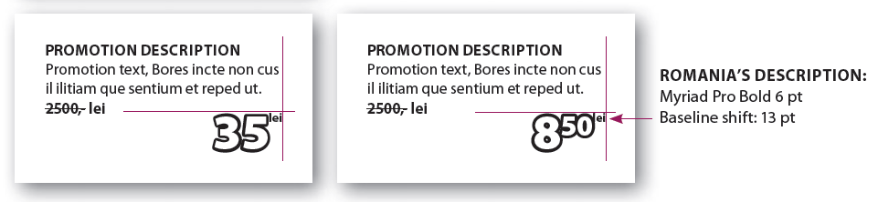
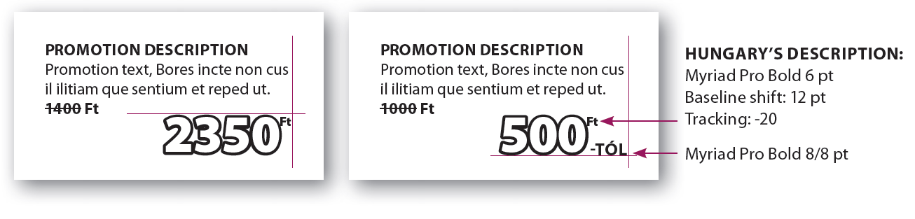
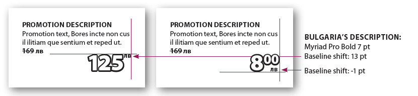
Countries that use currency designations in the form of letters after the price. The currency designation is positioned to the right over the dash if it is whole numbers. The currency designation has to be aligned with the upper edge of the price. If there are decimals, the currency designation is right-aligned under the decimals and aligned with the lower edge of the price. (OBS: with the exception of Romania).
- Croatia's description
-
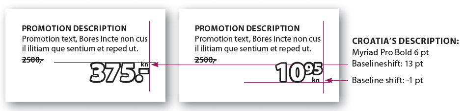
- Bosnia's description
-
- Serbia's description
-
- Romania's description
-
- Hungary's description
-
- Bulgaria's description
-
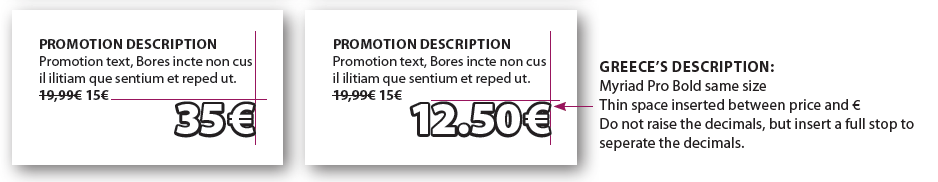
- Greece's description
-
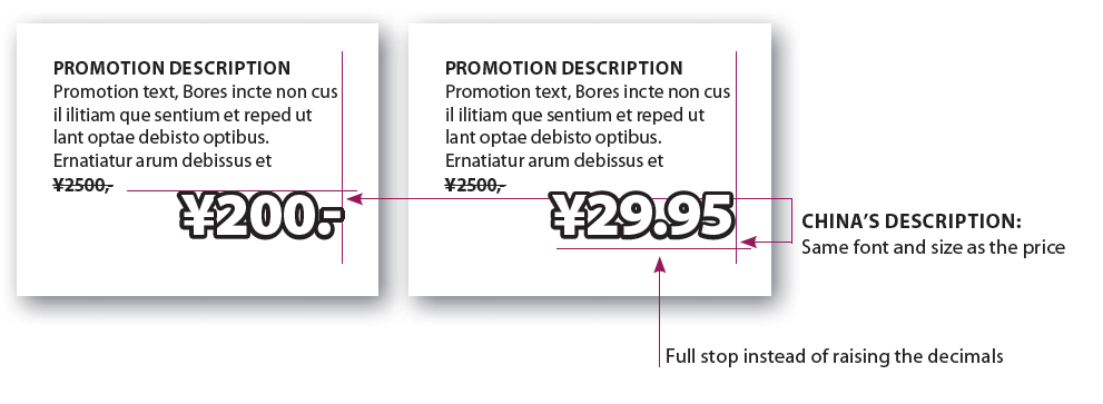
England and China
England and China use the symbol before the price and do not raise the decimals, but just put a full stop before the decimals.
- England's description
-
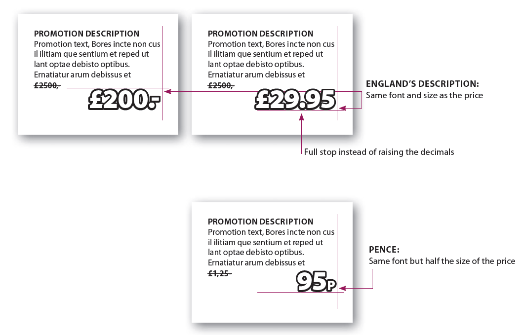
- China's description
-
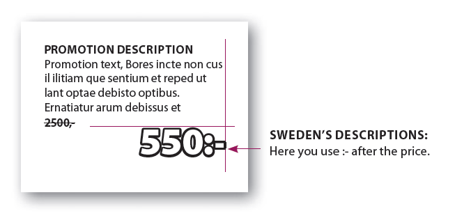
Currency Descriptions Sweden
Sweden have their own rules in relation to currency descriptions.
- Sweden's description
-
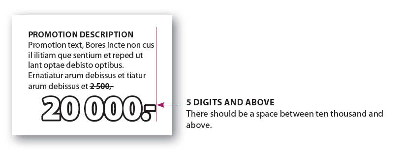
5 digits in price - all countries
For all countries there should be a space between ten thousand and above.
- 5 digits and above
-
Prices
Prices can only be used in white with black stroke that is rounded at the corners.
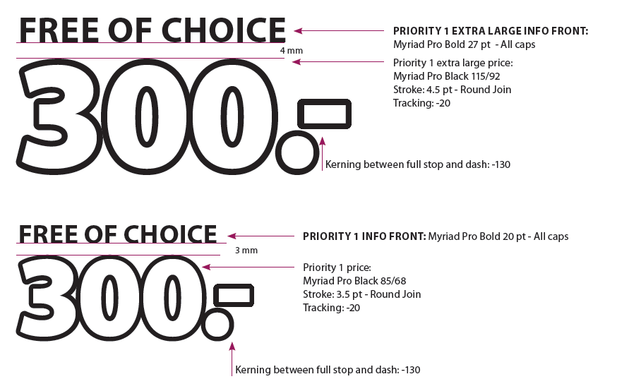
The extra large price is only to be used for priority 1 on the Front pages/stop pages, and only when the layout and amount of offers allows it.
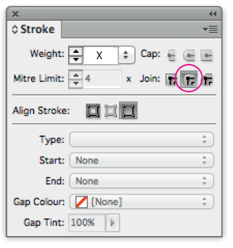
- Settings in InDesign for prices
-
- Priority 1 price
-
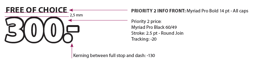
- Priority 2 price
-
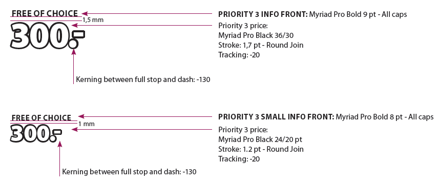
- Priority 3 price
-
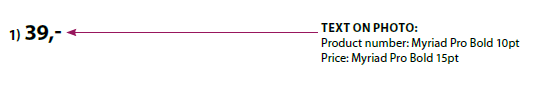
- Text on photo
-
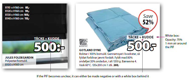
PIF (Price Info Front) and Prices
As a rule, the PIF (Price info front) is black, but if it becomes unclear, the PIF is made negative or with a white transparent box behind it. The price always remains white with a black stroke. The font sizes described below are fixed regardless of the length of the words. See Alignment of PIF further down on this page for guidelines regarding the alignment of price and PIF.
- Examples of PIF (negative and transparent box)
-
- Priority 1 info front
-
- Priority 2 info front
-
- Priority 3 info front
-
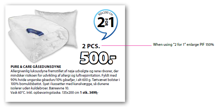
Exception - PIF in 150%
We increase the PIF to 150% when it says that we are selling more than one article.
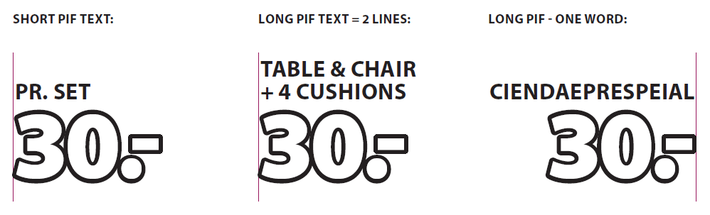
Alignment of PIF
A PIF with a short text must be aligned with the left edge of the price. A PIF with a long text must be split in two lines and be aligned with the left edge of the price.
However, we may not split the words. Therefore, if the words in the PIF are wider than the price, the text must be aligned with the right edge of the price.
This is to make sure the price will keep it’s position.