Page setup
Last edited: 12/09/2018
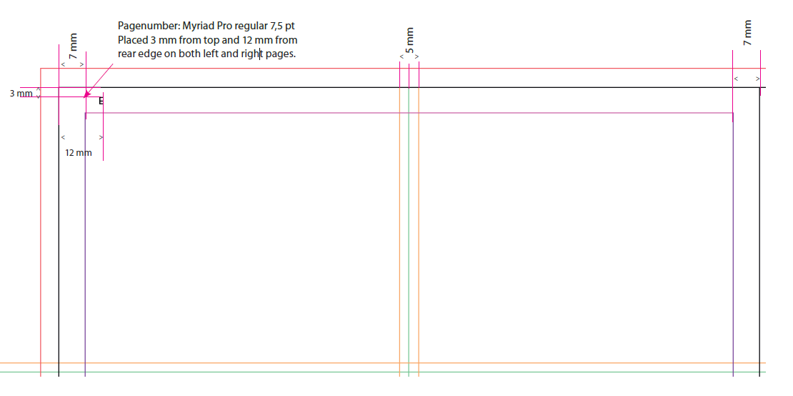
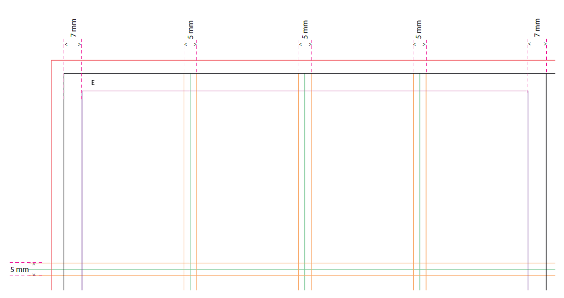
Pagina, margins, columns and guidelines
- 2 columns
-
- 4 columns
-
- Front pages - same column distance but different templates
-
Distance between coloured backgrounds, environments and text
There is no distance between coloured backgrounds or coloured backgrounds and environments. See examples below.
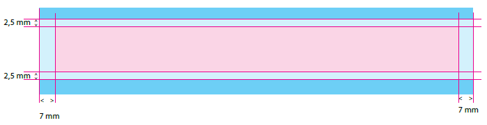
The text, logos, prices and savings are placed with 2,5 mm distance to the edge of the background or environment photo. Cut out photo is placed with some space from priority edge so it doesn’t look crammed up into a corner. How much space is up to the product. Massive products which fill out the priority fields need more space than flimsy products.
- Examples
-
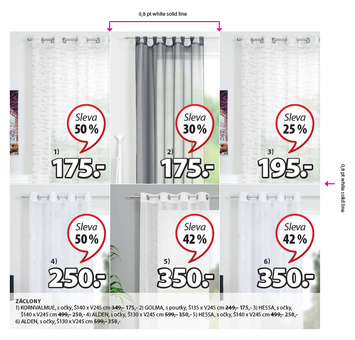
Hairlines between offers
If there is used no harlekin or environment images you can use a solid 0,8 mm line to seperate the offers. The line is placed in the middle of the 5 mm grid as shown in the example below. The line is continous through the page and has to go to bleed. The colour of the line is always described in the master for each campaign.
- Examples
-
Exceptions for pages with similar environments beside each other
Exception 1
If there are two or more environment images in the same priority placed beside each other you can make a white or 40% black hairline of 0,8 mm between the images.
The text, logos, prices and savings are placed with 2,5 mm distance to the edge of the enrivonment. If there is used a white transparent background behind the text you have to
align that field with the environment image. If it makes sense you are allowed to crop the environment image so the text is placed outside the image
See example below with lines in same priority.
- Example of exception 1
-
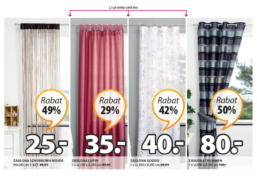
Exception 2
If curtain images in different priorities are placed beside each other you have to use a white or 40% black solid line of 2,5 pt. to separate the offers from each other.
- Example of exception 2
-
Examples of page setup and spreads
- Example of back page
-
- Example of front page
-
- Example of spread (without footer on right side)
-
- Example for spread (with footer on right side)
-
Example for spread shown with guides (with footer on right side)
Example for spread shown without guides (with footer on right side)
Example for spread shown with guides (with footer on right side)
Example for spread shown without guides (with footer on right side)
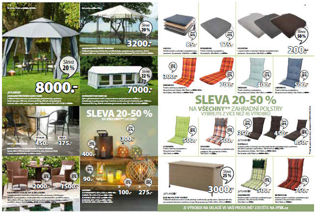
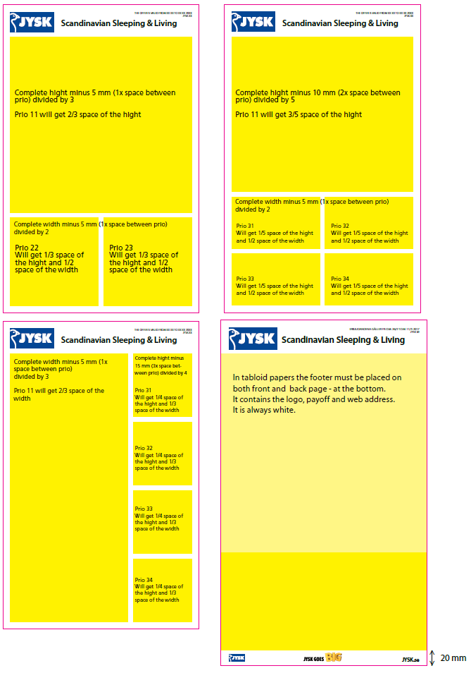
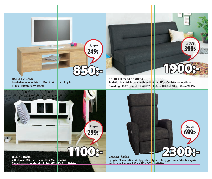
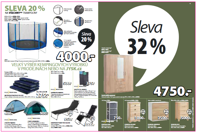
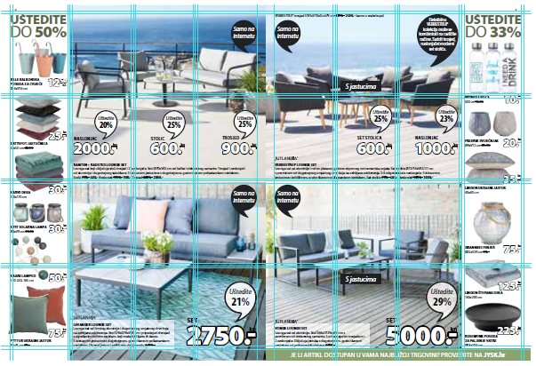
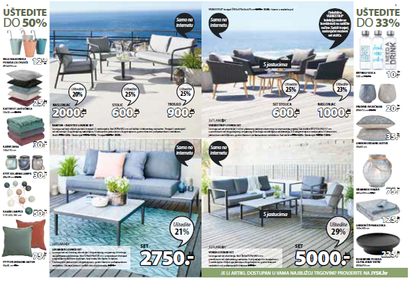
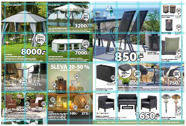
Category offer
Category offers can be visualized with contrast background color.
If the offers must have a contrast color, the category offer must be 4 squares or more.
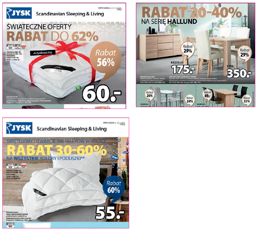
How to place commercial headlines
For each commercial message we use a headline. The text size and how many lines are used is different for each headline compared to the message and space it is given.
The text can be aligned to the LEFT (first choice), RIGHT (second choice but always used on left pages if headline goes across spread) or placed CENTERED (second choice or used to combine headline across spread or horizontal priority). If placing a headline in an envrionment picture, choose some space with calm background (no matter if it is top or bottom). If necessary it is allowed to use some light or dark blur on part of the image to make the text more readable, but this should only be used as a last opportunity.
Make sure blur doesn’t fade into white on environmental photos Make sure the headline has some space and isn’t crammed into a corner or between products.
TEXT: Myriad Pro Regular and Black - All Caps. Fontsize is up to the agency to make it dynamic and fit properly to the given space. Colours are defined in each campaign.

- More examples of headlines
-
- Examples of Headlines placed on a page
-
Pages with commercial messages
Please notice when having a headline on a page/spread the headline will always take space from overlapping squares of the 4x4 grid.
If the headline applies for the whole page alle products gets less space. If the headline only apllies for some products thea headline only takes space from
these products. This means that all other products get their full priority field.
- Example of headline applies to whole page
-
- Example of headline only applies to some products
-
- Example for headline applies for spread:
-
Use of competence box
As a rule, the Competence Box is placed in the bottom of the page. If this placement does not make sense in relation to the products, it can be moved on the page, but the text should always be in a white transparent box (70%) across the page.
Only the height may be adjusted.
- Example of competence box
-
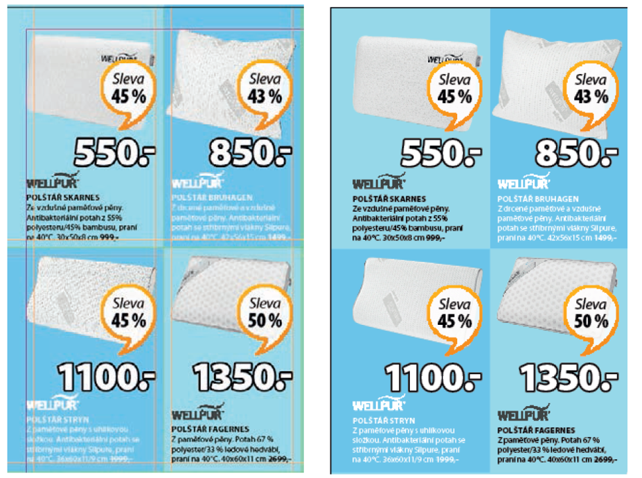
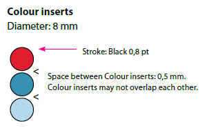
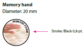
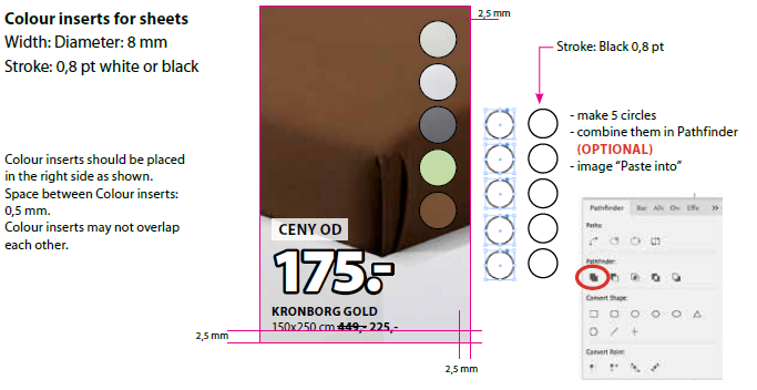
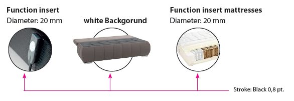
inserts - sizes and variations
- Colour inserts
-
- Memory hand
-
- Colour inserts for sheets
-
- Function insert
-
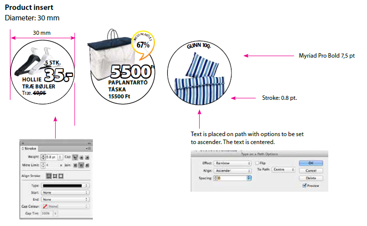
- Product insert
-
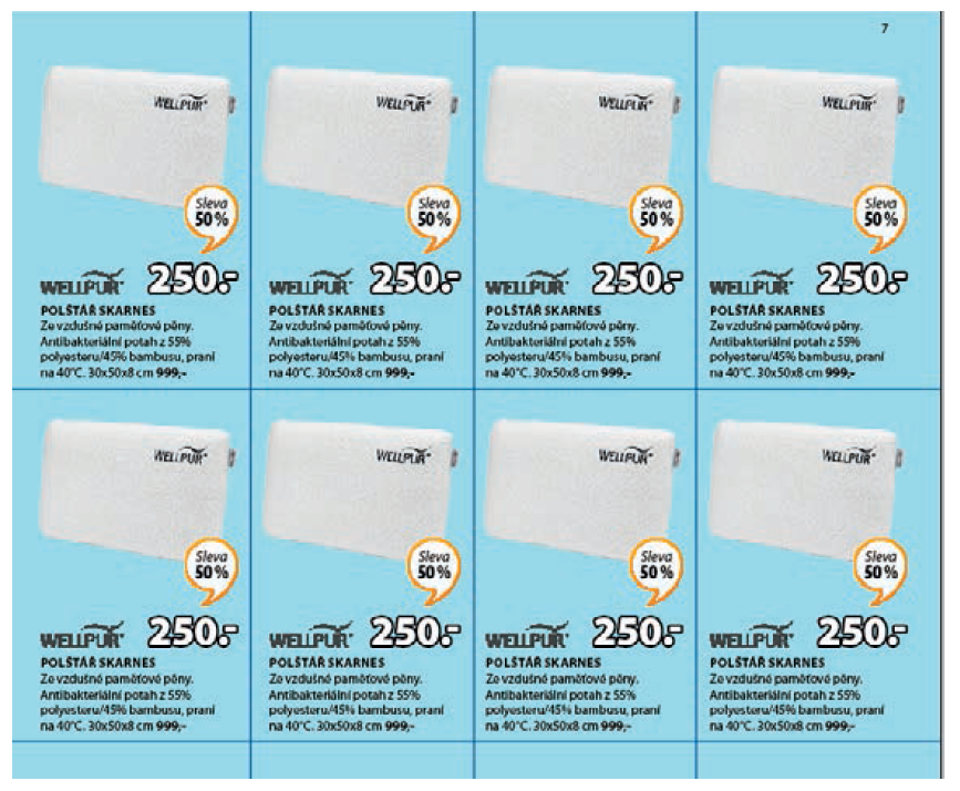
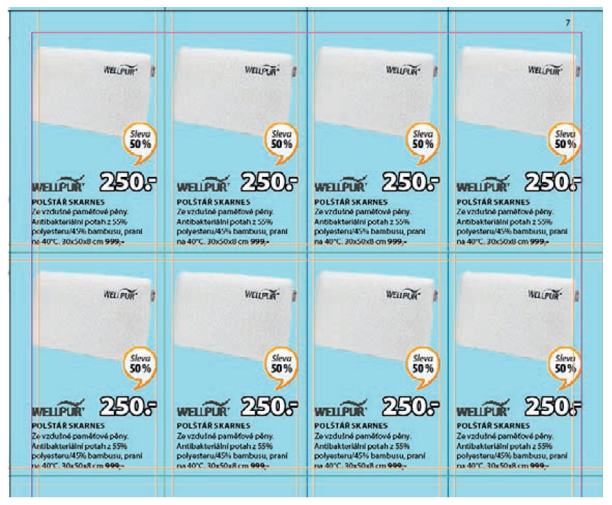
- Placement of product inserts with bed linen
-
The product inserts are meant to overleap. All circles must be distributed vertically with the same distance between each other. The product inserts cannot cover
the product name. The bottom part of each product insert should be placed underneath the following product insert.
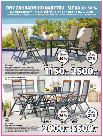
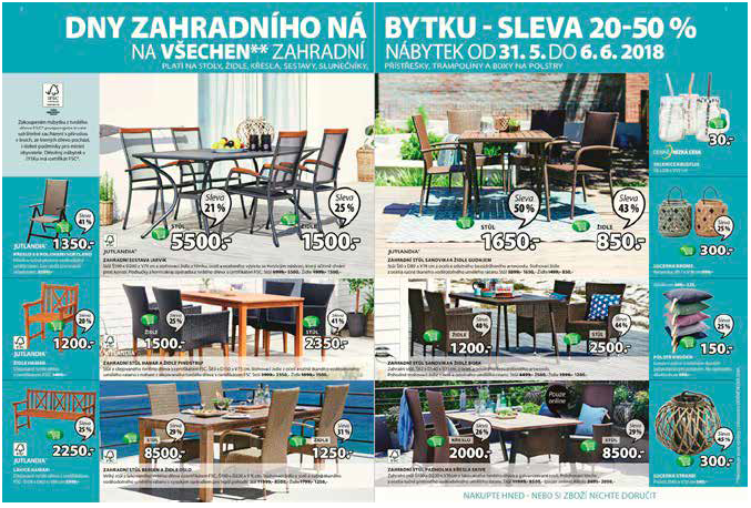
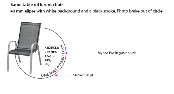
- Same table - different chair
-
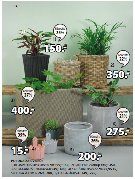
Numbering of products
Numbering always starts (if possible) from the left to the right, and always (if possible) always right-hand side of the product.
Prices related to the number must always be placed right-hand side of the number.
Font of the number: Myriad Pro Bold in 10 pt.
Font of prices: Myriad Pro Bold 15 pt.
![]()
- Examples
-
- Numbering products on environment
-
Numbering on environment looks like the example below. Here we use Prio 3 small prices (24 pt) and numbering.