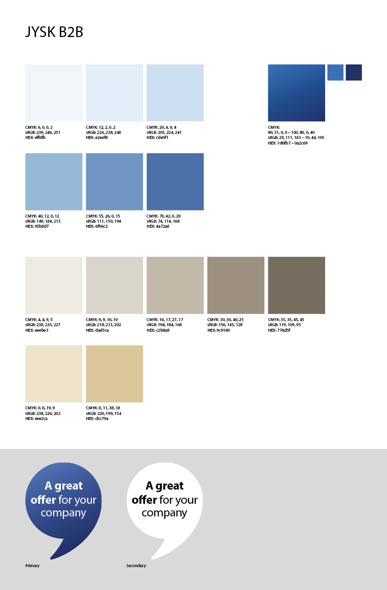
Colours
Last edited: 05/12/2025
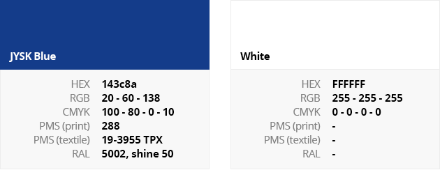
Logo Colours
The colours of the logo are defined according to the following international standards:
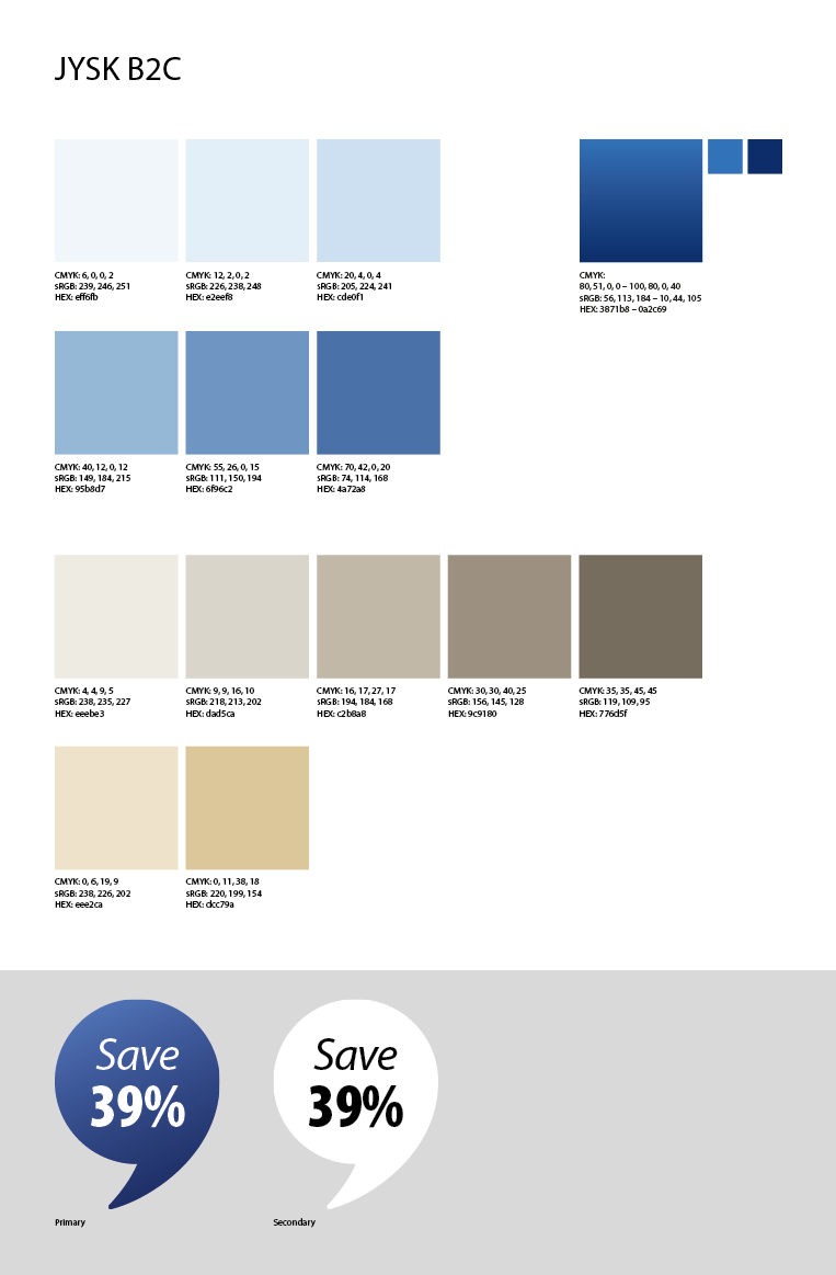
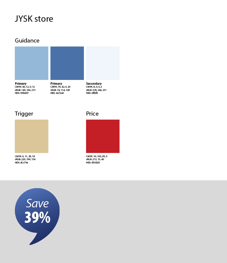
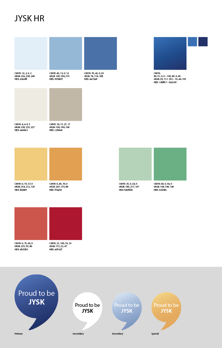
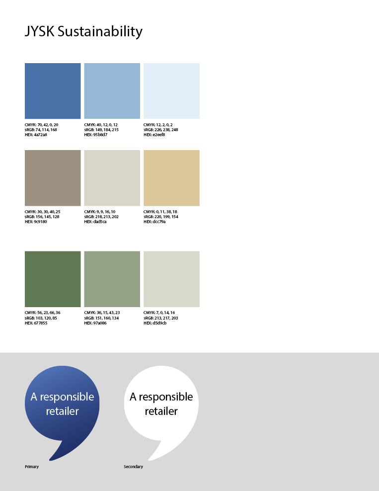
JYSK colours
There are different colour schemes for JYSK B2C, stores, HR, sustainability and JYSK B2B. See setups and values for CMYK, RGS and Hex below.