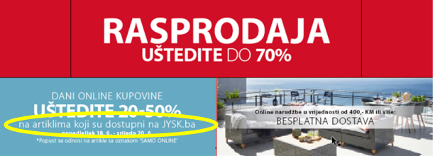
Web fronts
Last edited: 03/07/2024
1. What is webfront
Webfront is the very first element that our customers encounters when one visit JYSK online website. It takes a very little time for a person to form an opinion about website – that determines whether they like/click or leave. Thus it’s important to make it good.
Web fronts are graphic used on main JYSK pages to promote ongoing campaigns and Special Activities. To secure consistency, all countries use the same graphic layouts and templates.
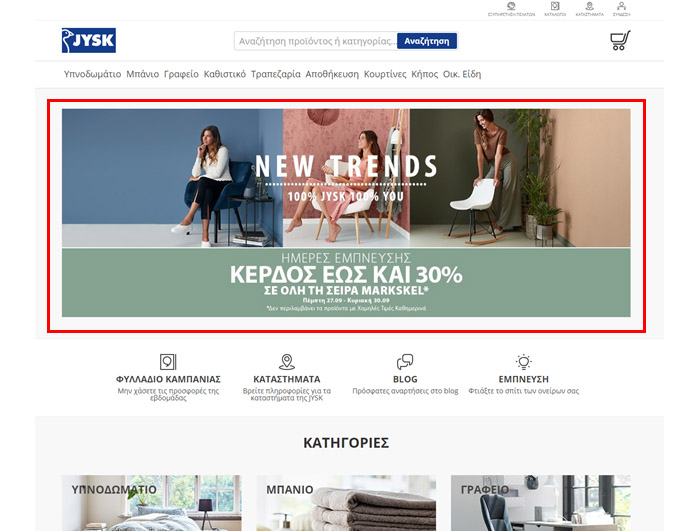
Example of Greek webfront, displayed at www.JYSK.gr
1.2 Campaign themes
- In JYSK webfront there is allways a Campaign theme element in PRIO11.
- Graphic and text is defined in kick-off material and it’s mostly non-editable.
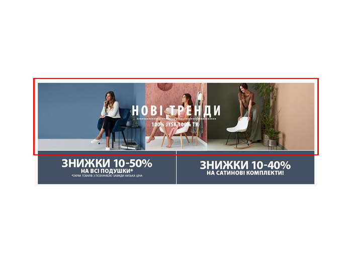
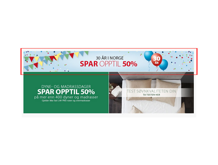
2. Layout, text and graphic
2.1 Template layout explained
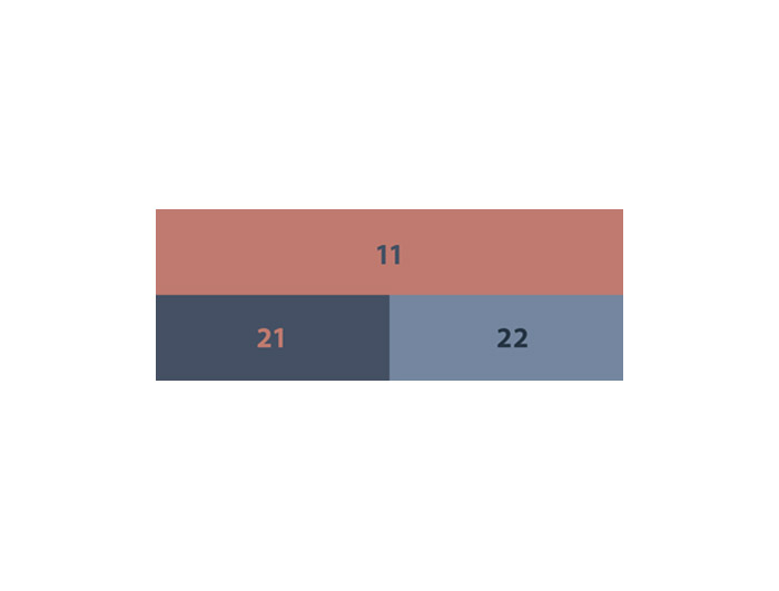
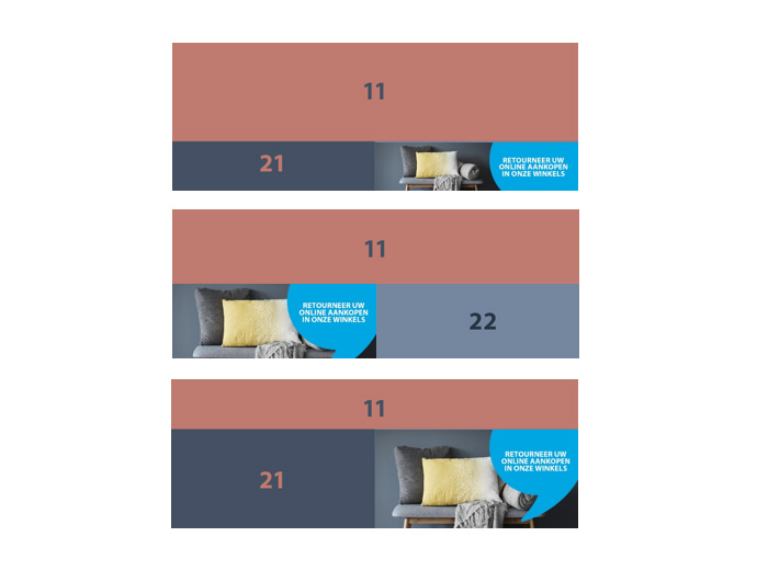
- Webfront is build from several elements. There is an exact amount of combination you can use.
- Number in webfront name stands for the amount of elements.
- Letter in webfront name stands for the prios size.
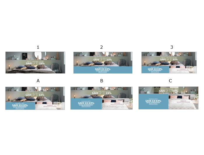
- Template 1A
-
Only used in very special cases.
Will be stated in kickoff when applicable.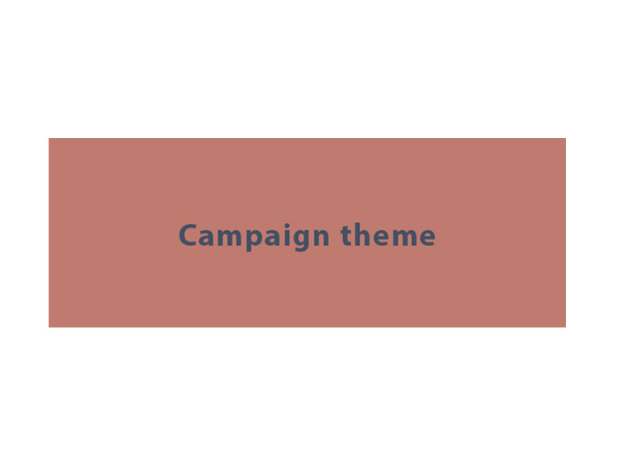
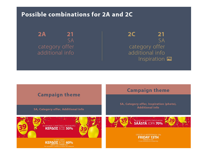
- Template 2A and 2C layout
-
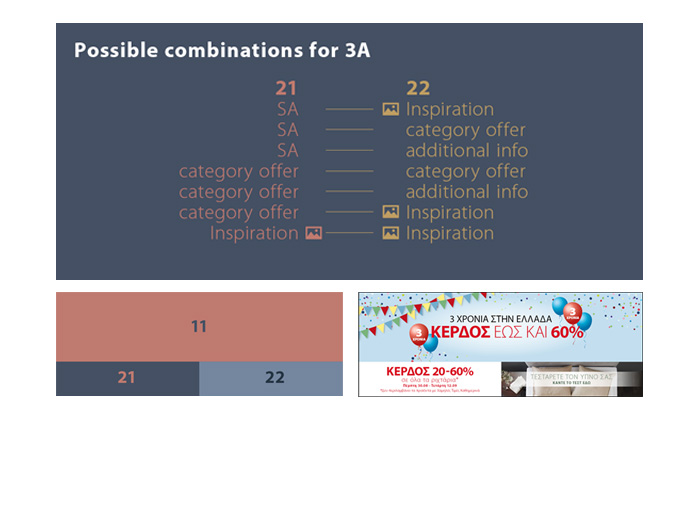
- Template 3A
-
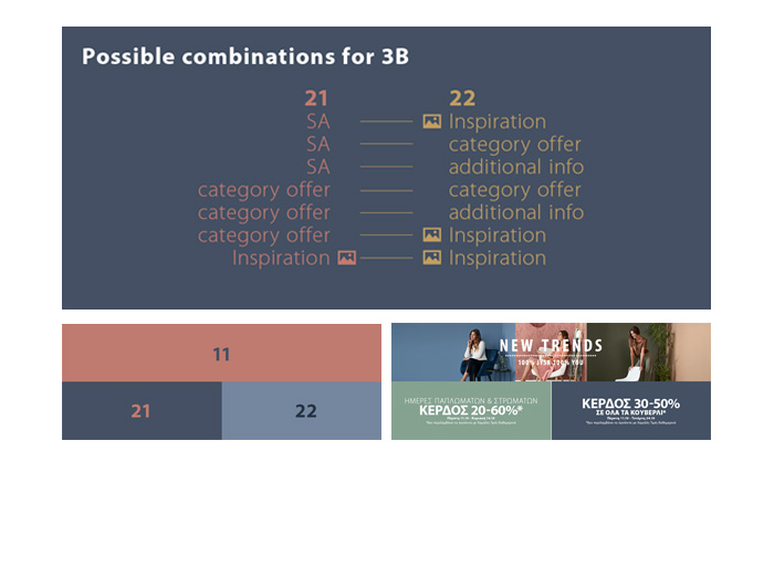
- Template 3B
-
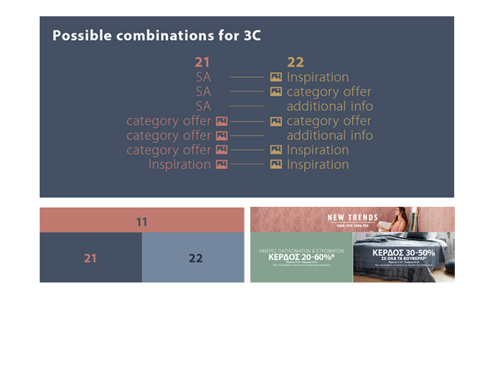
- Template 3C
-
Templates: Cheat sheet (ver. 2.0)
[px]
2.2 Prio 11 - Elements
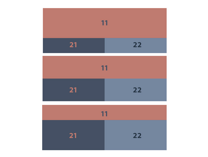
- Prio 11 is allways on top. It’s allways related to Campaign Theme and most elements are not editable.
- Campaign themes must always be present on the webfront. In manus please chose prio 11 for the campaign theme. Create a comment to agency stating: use the campaign theme and if applicable a relevant heading to go with.
- This element is allways used for mobile along with prio 21
2.2 Prio 11 - Text rules
- 1st headline – max 28 characters, space included
- 2nd headline – max 15 characters, space included
2.3 Prio 21 - Elements
- If SA – no photo. Prio 21 will always have plain background.
Add in comments to agency: Layout SA generic - Category offer – you can use photo or color as background. Color background is defined in Graphical Master for the specific campaign. Photo ID is defined by SMDC in manus.
- Inspiration – only if prio 22 is also with Inspiration. You have to use photo.
- Always place SA on prio 21 as it is the element used for mobile (goes with Prio 11)
2.3 Prio 21 - Text rules
SA headlines:
- 1st headline – theme (duvets days) max 30 characters incl. space
- 2nd headline – saving headline (save xx-xx%) max 16 characters incl. space
- 3rd headline – additional text (on all xxxx) - max 30 characters incl. space
- 4th headline – date - max 50 characters incl. space
- 5th headline – text excl. Everyday Low Price - max 50 characters incl. space
2.4 Prio 22
2.2.1 Prio 21 and 22 headlines
Category offer headlines:
1st headline – saving headline (save xx-xx%) max 16 characters incl. space
2nd headline – theme (on all xxxxx) max 30 characters incl. space
3rd headline – date max 50 characters incl. space
4th headline – text excl. everyday low price - max 50 characters incl. space
Inspiration headlines:
1st headline – max 40 characters incl. space
2nd headline – max 22 characters incl. space
Additional info headlines:
1st headline – max 30 characters incl. space
2nd headline – max 16 characters incl. space
3rd headline – max 33 characters incl. space
- 2.5 Mobile version
-
Webfront looks different in mobile mode: there are only two Prios visible: 11 and 21.
- 2.6 Tell messages in webfronts
-
- Tell messages are the messages that we in JYSK has decided to put focus on – besides the overall branding messages about “Scandinavian Sleeping & Living. These messages can be combined with the branding/content messages and campaign messages. It is up to each country to plan and structure the implementation. We recommend using the “Implement study” to find out which messages will have the highest impact in your country.
- Tell messages are a ready-made elements designed only for 3A, 3B and 3C webfront layout.
- Shall be placed either on prio 21 or 22
3. Manus
---old---
Few helpful rules when creating a WEBFRONT order & IDG manus instructions
- pick only from the available layouts in presentation
- mind the text limitations (number of letters in one line – longer sentences won’t fit
- look close how many text lines have to be placed in each prio – there should be no more and no less
- SA = no photo in background
- Category offer – only available with photo for OW_3C (OW3C is the biggest - see below)
- IDG-manus has to be named exactly after the order name
Lowercase sentences
Some parts of web front consists of all-lowercase sentences. In this case the only exception from using all small letters are product names, brand/series names and JYSK name.
