The JYSK logo
Last edited: 18/09/2025
This section describes the use of the JYSK logo. The JYSK logo must not dominate other messages communicated within the same frame of content. The logo should draw attention towards the sender (JYSK), but it should by no means overshadow other messages, for instance a campaign message.
Our logo is rectangular and the goose is used as counter-balance representing a softer form to the box. In addition, the goose has a historical thread to our brand and is a means to differentiate JYSK from our competitors and other companies with rectangular, box-shaped logos.
Download JYSK logos
In case you need a logo for facade material, packaging, presentations, invitations or maybe for an internal folder you can download it in different colour types and fil formats below:
- CMYK
-
- Pantone
-
- Logo with white outline
-
CMYK
Pantone
RGB
- CMYK logo with Payoff
-
- RGB logo with Payoff
-
- RGB
-
- Raster graphic formats
-
- Social Media profile logo
-
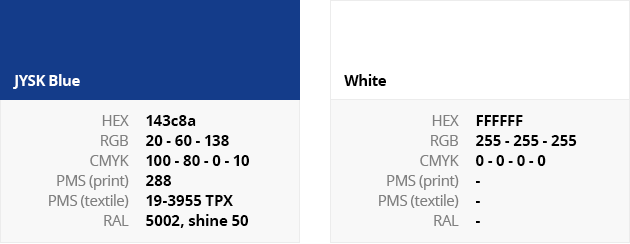
Logo colours
The colours of the logo are defined according to the following international standards:
In the logo, JYSK is written with Futura (ExtraBold) font.
The JYSK logo must by no means appear in other colours or using other fonts
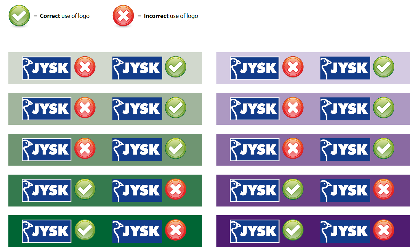
The JYSK logo is a box logo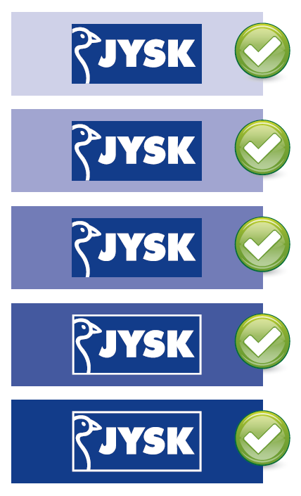
The logo is a box logo – and it should always be visible that it is a box.
When the contrast is too low between the box and the background, the box can become almost invisible. In these cases, we add a white outline to make the logo box visible. However, if you are unsure if the contrast is to low, it is preferred that you use the logo without outline.
Exception to the rule: In video/film/moving pictures the background can change from light to dark constantly. In this case the logo should not change with the background as this would cause the logo to flicker. Chose which logo version is the most appropriate and stick to that logo for the entire video. (If the logo changes position during the video it can be OK to adjust the logo when the position is changed.
If in doubt, take a look at the extended examples below.
- More examples of background colour
-