BUSINESS TO BUSINESS logos
Last edited: 03/07/2024
In this section you can download the BUSINESS TO BUSINESS logos. The logos follow the same basic rules as the normal JYSK logo.
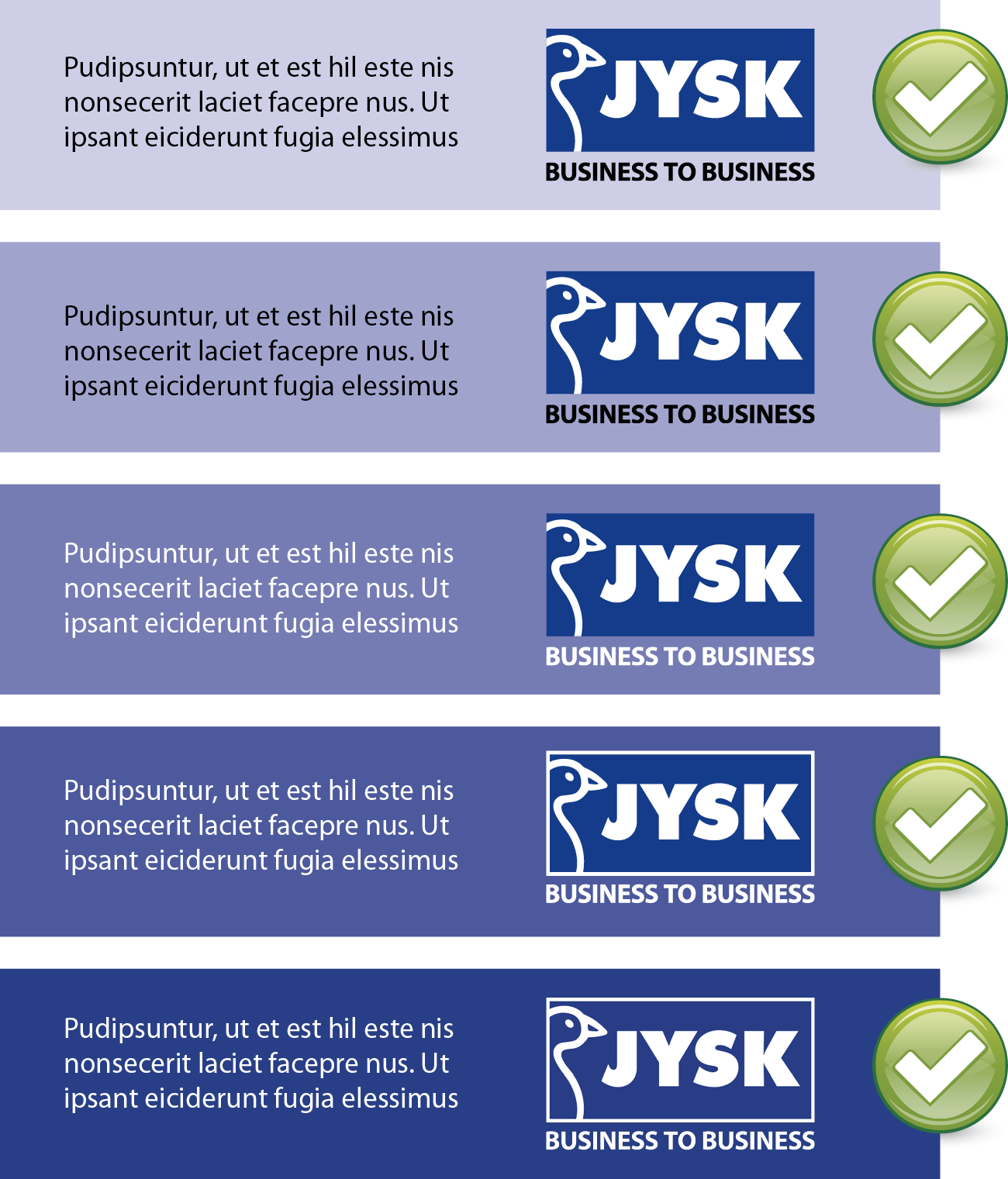
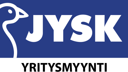
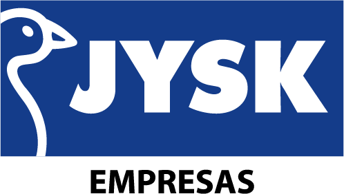
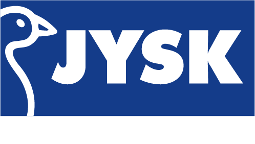
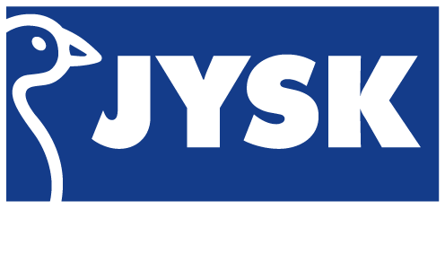
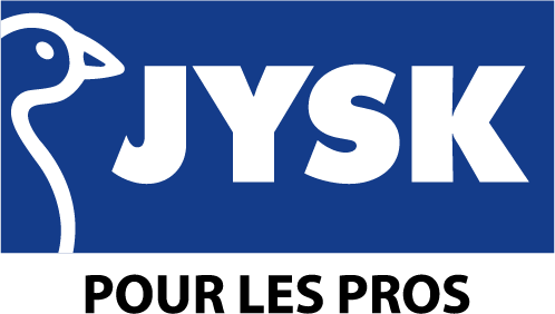
The JYSK business-to-business (B2B) logo consists of the standard JYSK logo with the addition of “business to business” as an additional line of text below the logo. To ensure that the logo is always clearly visible, three variants are used depending on the background and context that the logo is to be shown in. See the examples below.
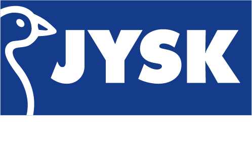
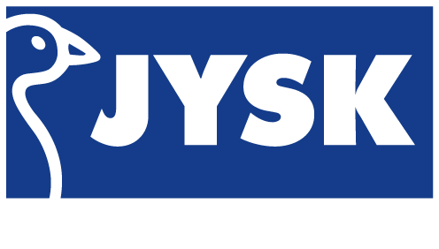
The JYSK box logo
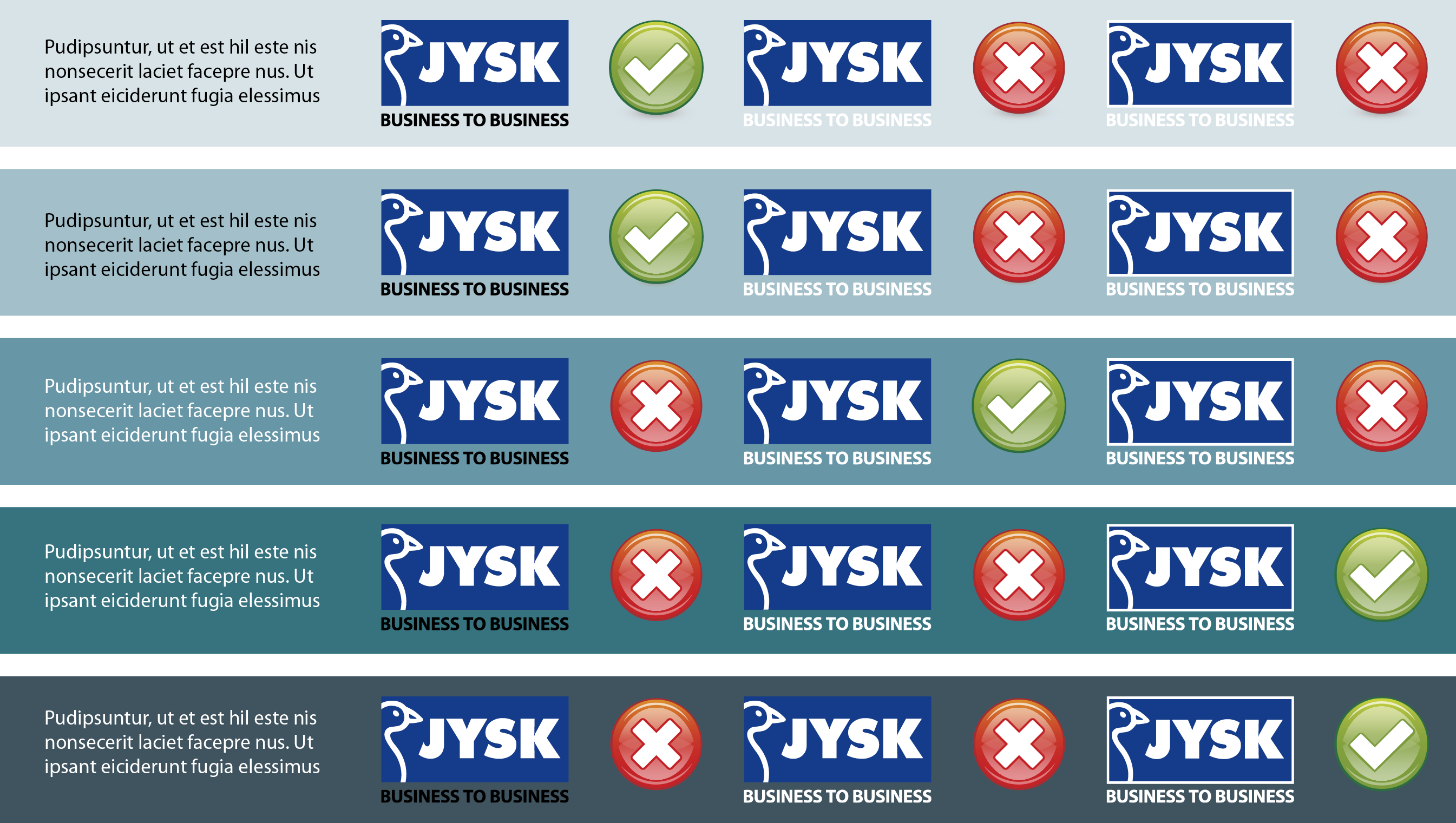
By design, the JYSK logo is a box logo. As such, the square shape of the logo must always be clearly visible and distinguishable from the background. In situations where the logo is to be used on a dark background, the square shape of the JYSK logo can end up being barely visible. In such cases, a white outline is added to clearly differentiate the logo from the background. See the examples below.
The “business to business” line of text
In situations where the logo is to be used on a darker background, the contrast between the background and the “business to business” line of text can end up being too low. This will cause the text to become difficult to see and differentiate from the background. In such cases, a negative variant of the “business to business” text – white rather than black – is used instead. This allows for the text to be clearly visible on darker backgrounds. See the examples below.
Increase the visibility of the logo with high contrast
To ensure that the JYSK business-to-business logo is clearly visible, keep in mind to always maintain a high contrast between the logo and the background. Even if you yourself can discern the logo from the background, others might not perceive the distinction as clearly.
For printed materials, the threshold for sufficient contrast between logo and background will be higher than for digital materials. To ensure that the logo is clearly visible in printed materials, it is ideal to aim for a higher contrast than initial expectations would suggest.
Exception to the rules
In dynamic content such as video, film, and moving pictures, the background will often change constantly between light and dark. In such cases, the logo should not change alongside the background as it would result in a flickering, inconsistent experience. Instead, decide which variant of the logo is most fitting for the situation and use it throughout the video. If the position of the logo changes in the video, it can – if it makes sense in the particular situation – act as an ideal point to swap to another variant of the logo.
- CMYK
-
Finnish version
Spanish version
French version
- RGB
-
Finish version
Spanish version
French version