Newsletters
Last edited: 03/07/2024
Newsletters are used by JYSK to advertise campaigns and different activities along the Internet.
- Example of newsletter
-

Design rules:
While designing an email to customers, you will have different elements to choose from. Be creative and make your message inspirational.
Basic rules are following:
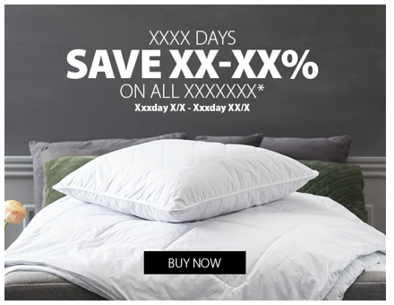
- If your email is based on a special Activity it must always contain a banner in the top of the email, like shown in the template. The top banner has a fixed size: 580x450px.
- In special cases it is ok to start email with image size 580x180 or a welcome text for the customer. SMDC decides when this makes sense.
- There is no separator between JYSK button in the top and the top banner.
- There must be a separator in between all blocks that you insert below the top banner.
- You must insert a separator above the footer.
- You are not allowed to use other font types than the ones set as default
- You must keep Blue Line
Top banner
Size of Top banner is 580x450
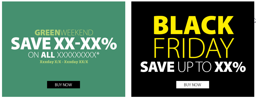
Text and gradient with picture in back. This banner is always used for SA with CTA button.

Version 1: Text on gradient placed in center. Use SA colors from graphical master or use black/white.

Version 2: Text on gradient placed in top. Use SA colors from graphical master or use black/white.

Version 3: Text placed in center directly on the picture.
Use SA colours from graphical master or use black/white.

Version 4: Text placed in top directly on the picture (use guideline in the document).
Use SA colours from graphical master or use black/white.
This banner is used for SA with CTA button and in special cases also campaigns such as Black Friday.

Download
Templates for top banner can be downloaded here: \\Aarhus-8\JYSK-FAELLES\SMDC's\Graphical masters - layout\Newsletter topbanner
All guidelines regarding different aspects of newsletters can be found at: https://myjysk.thinktime.com/Learn#/kbasewithtopics/75
