Interior design guidelines
Last edited: 14/11/2025
WELCOME CUSTOMERS AND COLLEAGUES WITH A SCANDINAVIAN AMBIENCE
When it comes to decorating our offices, it is important that the look and feel reflects JYSK’s DNA and our
Scandinavian roots. This is where we as employees spend many hours a day and where we welcome customers
and visitors. Let’s make sure we can be proud of the surroundings and feel right at home.
On the following pages you will find interior design guidelines, covering everything from colours and materials
to specific areas, wall decorations and office accessories.
The guidelines apply to both head office and country head offices.
Wall colours
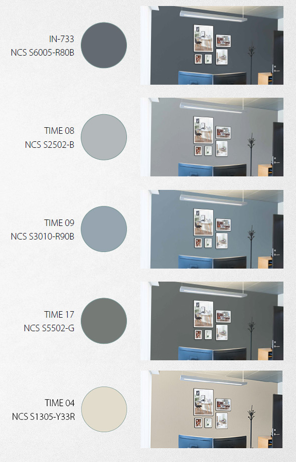
White is used as our main colour for walls. As a rule of thumb there should be one wall with a contrasting colour in offices and meeting rooms. For the contrasting colour you can chose from below options. For walls in hallways, reception/lounge and canteen areas the same above rule applies in general however there can be circumstances that require that these areas are handled as seperate cases and may benefit from more than one wall with colour from below options.
Floors
Wooden floors offer a beautiful soft touch to the ambience. Choose a light wood species for a typical Scandinavian look and feel.
And please remember: Before you fall in love with a specific species do make sure that it is durable as many people will be walking on the floors every single day for many years to come, especially in corridors.
In offices and meeting rooms, you might want to consider wall-to-wall carpets for the sake of acoustics.
Wall decorations
Photo wall
Photo walls are optional and should not be overused. They can be used to create a very special ambience – especially in meeting rooms and lounge areas. We have chosen nature photos of calm situations with reference to Scandinavia. Here you will find the chosen motives. Photos are available for download below. Please chose the corresponding filename for required photo. Notice that the photos needs to be adjusted locally to fit the wall that it should be used for. It is also an option to use 70x100 cm frames in meeting rooms with the approved images.
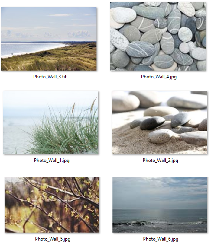
Photo 3 exceeds max file size. Please contact MNBF
Photo 3 exceeds max file size. Please contact MNBF
Pictures
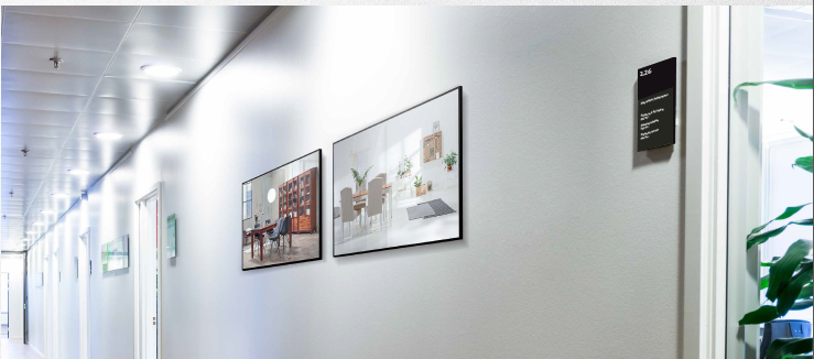
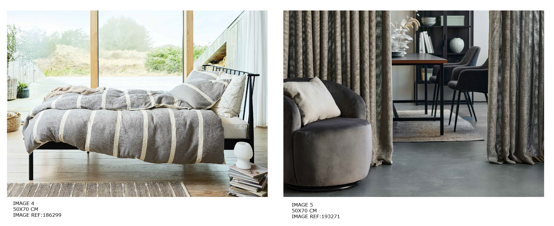
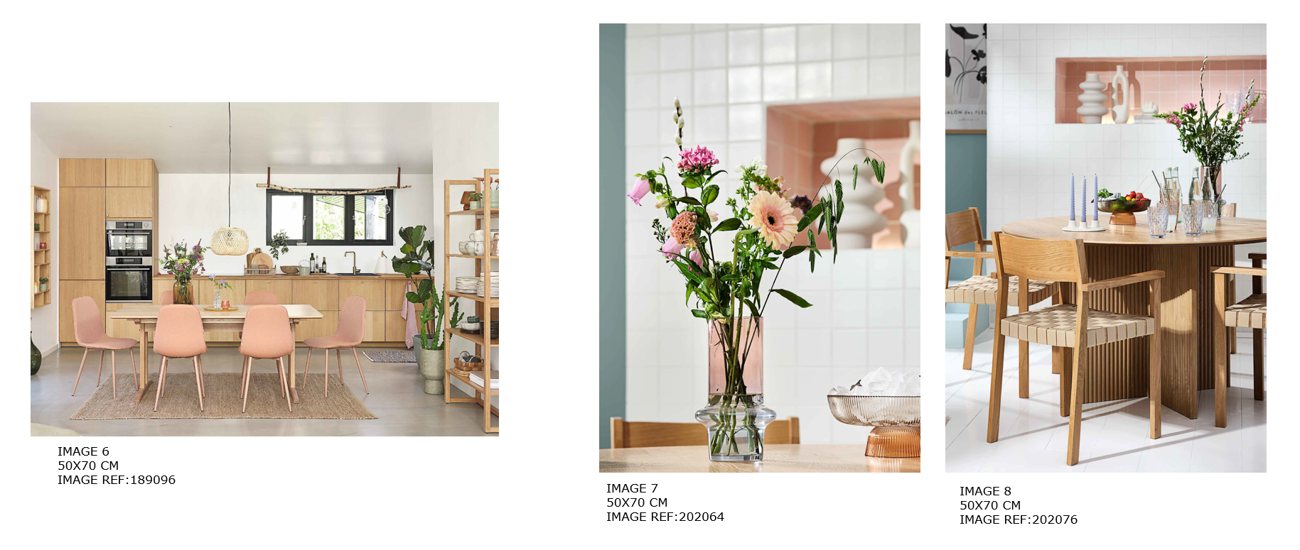
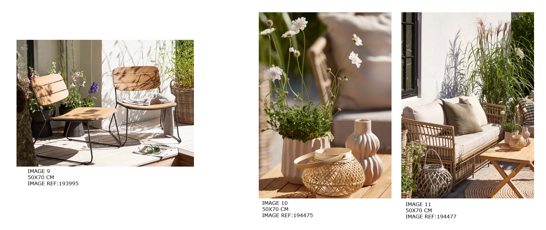
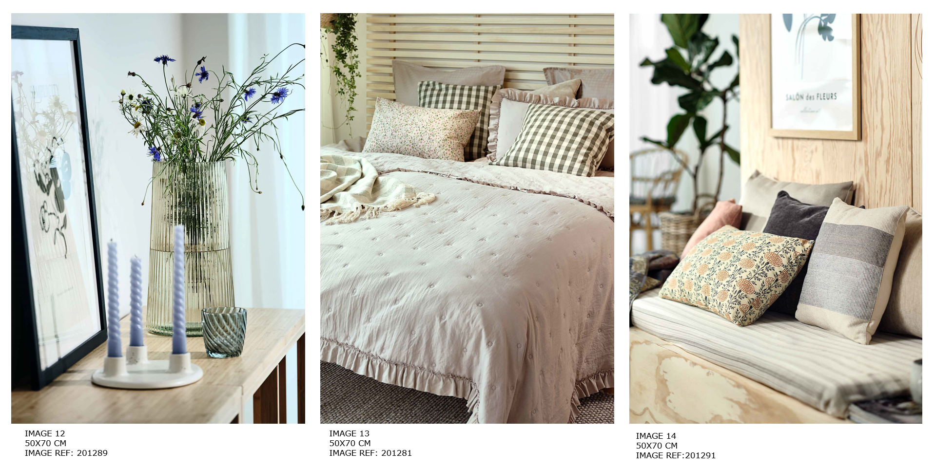
Pictures can be used in both offices and hallways. Use 70 x 50 cm frames.
You can find approved pictures here, the "IMAGE REF" refers to the image ID in Media Management where they can be downloaded in high resolution:
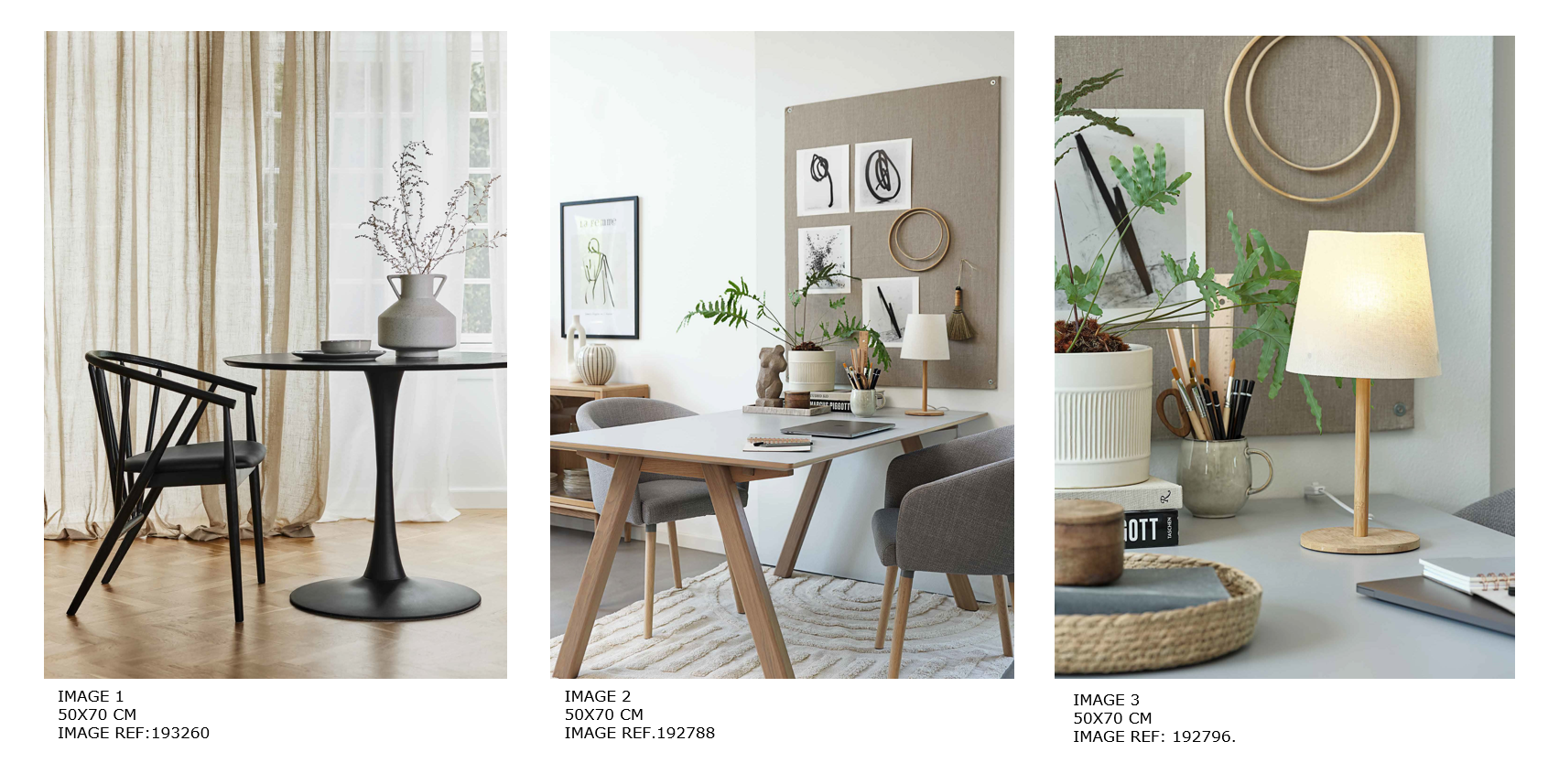
For HO denmark:
The pictures are only for offices. The hallways will have a different setup.
Ordre new pictures at the caretaker, it is self-service when you change them inside your office.
NAVIGATION
Only used for large buildings where navigation can be a challenge.
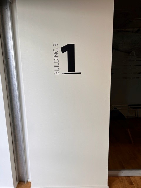
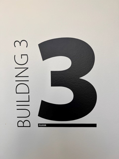
For navigation use a foil for walls.
The navigation sign should contain both Building number (if more buildings) and Floor number. If you need the design files please contact the marketing department.
Plants
Plants can be great to create a nice and cozy office environment. It is important that its not overdone and that the plants are kept in nice condition or they will have the opposite effect. If feasible a local supplier that provide plant services can be employed.
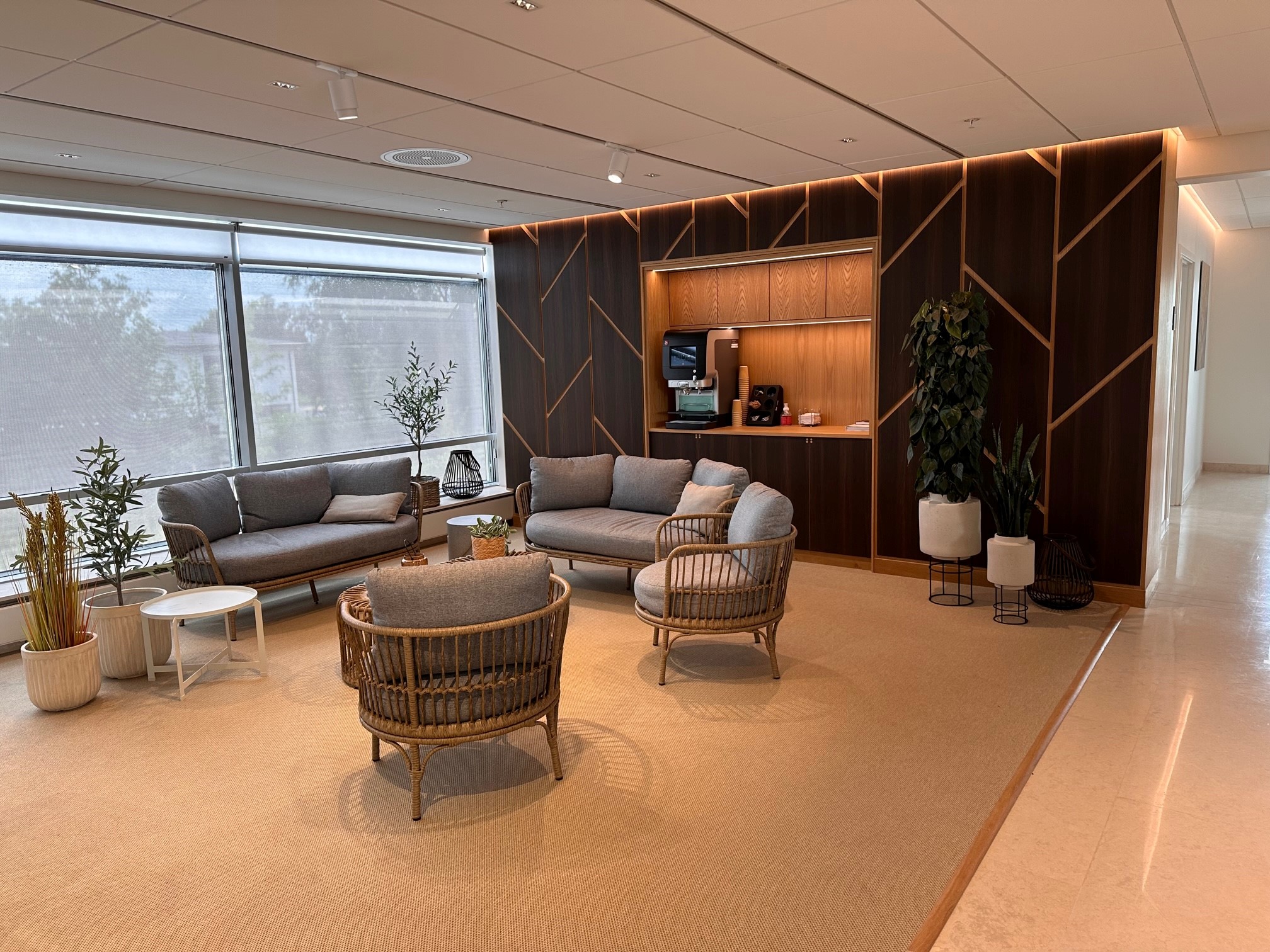
Furniture reception & lounge area
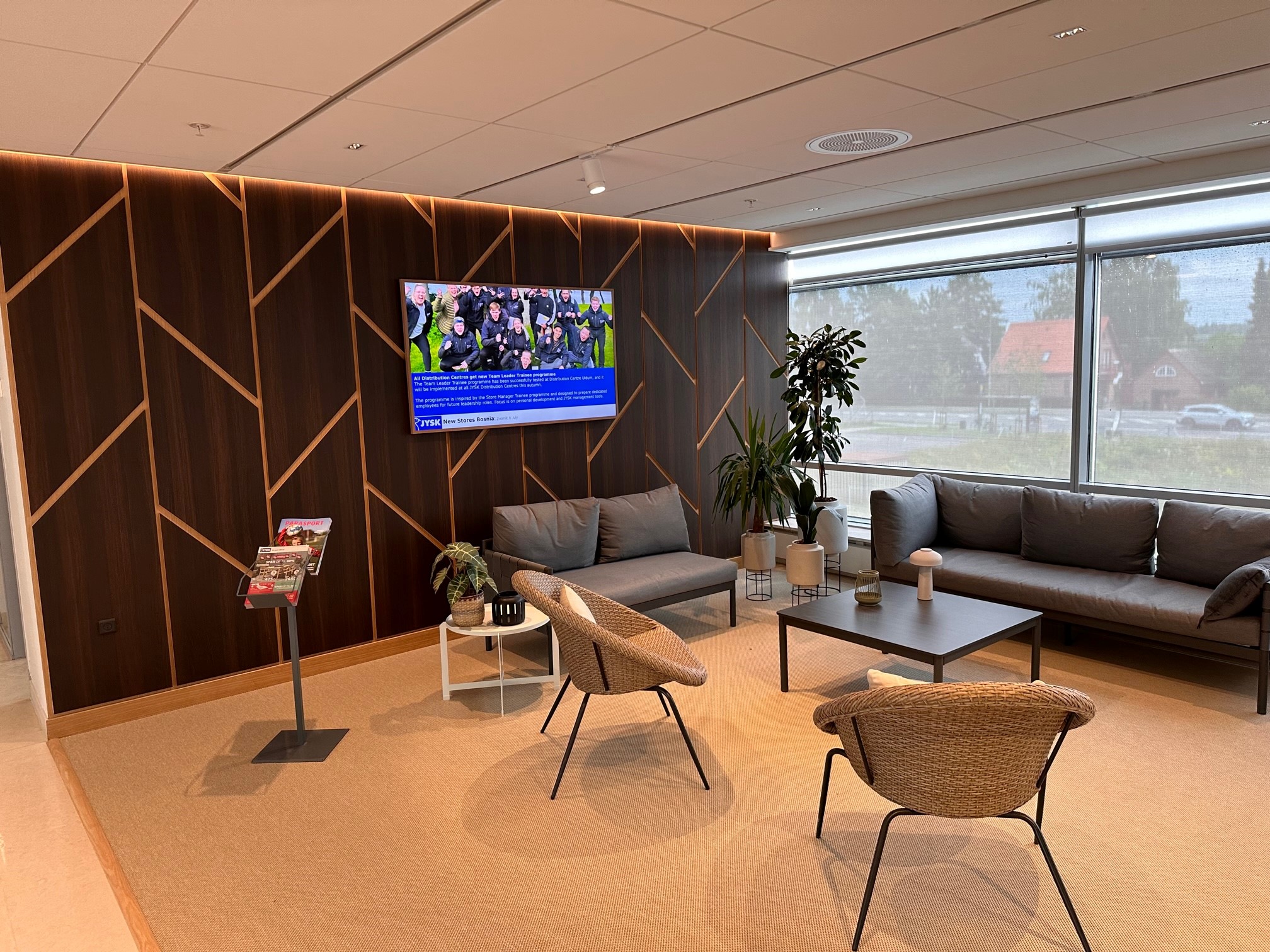
The furniture in the reception and in lounge areas should reflect the latest trends. Twice a year we should update the styling. Please, consult the Visual Merchandise handbook for guidance on the chosen styles and presentation. If you are in doubt please contact your local Store Concept Manager (SCM).
Strategy posters for meeting rooms
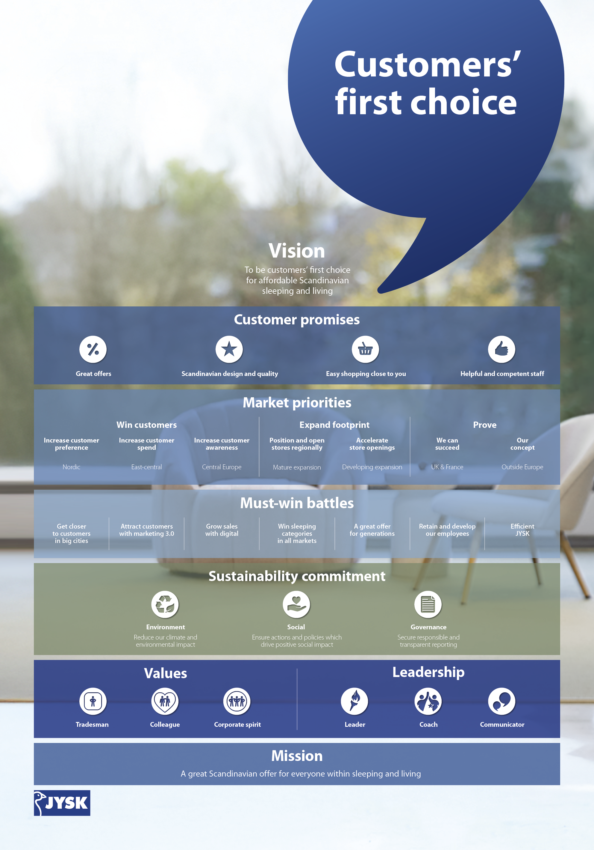
For meeting rooms please use the below combined strategy poster. The poster is 70x100 cm and should be placed in a black neutral picture frame (JYSK doesn't sell one in this size unfortunately).
All Meeting and one person rooms should have a strategy poster. It is also OK to use them in other offices where it would make sense. E.g. Large offices with many people or offices with overly empty walls.
The print ready file can be downloaded here: http://jbl.web.jysk.com/strategy-poster-head-offices
General office accessories
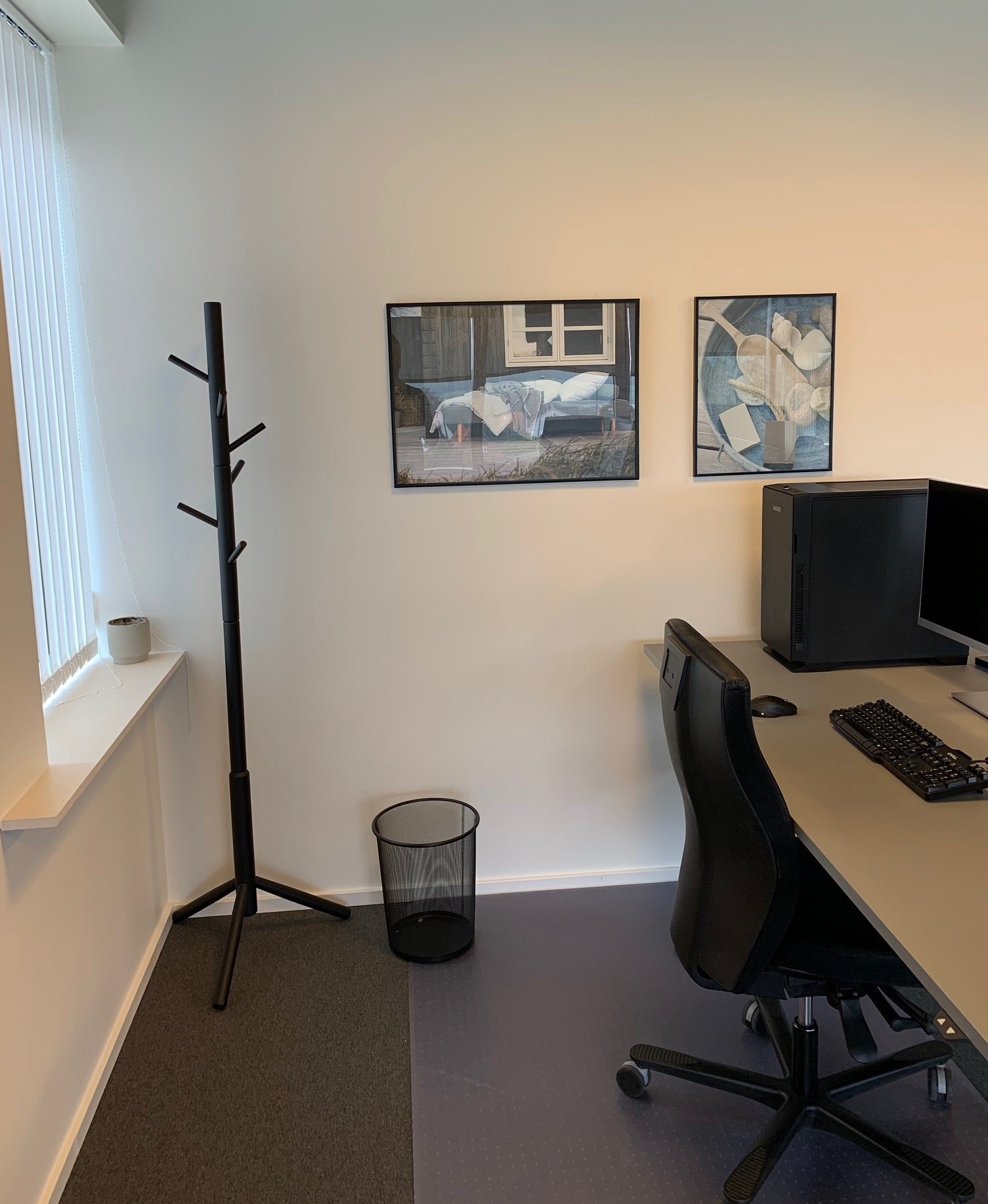
Nothing can “disturb” an otherwise beautiful ambience more than a messy desks. The best way to counter this issue is to have desks that allow for storage. And give the surroundings a “clean” look using common Coat Stands and Bins (similar to the one shown) in the offices.
Keep storage furniture to an absolute minimum and only have it if its required for storage.
Christmas decoration needs to be kept inside own office space not in hallways and open areas besides reception and similar coordinated by Range and Design.
Window foil or blinds
Foil on windows or blinds to offices and meeting rooms should be applied where privacy can be an issue.
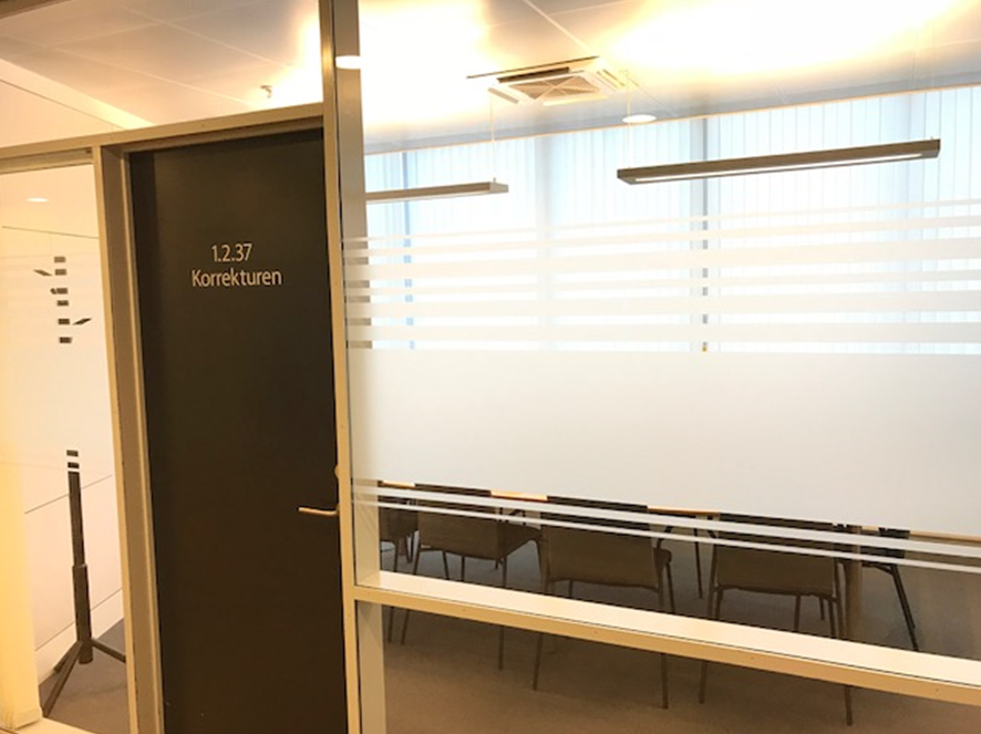
On front glass in meeting rooms and offices there should be used a foil in frosted layout.
In meeting rooms the room number should be on the door. In offices the room number should be on the designated door sign besides the door.
For meeting room names we use names that relate to JYSK. For inspiration please refer to the Head Office in Denmark.
Offices / room numbers
In offices the room number should be marked outside the office.
The solution contains two parts:
- A fixed part with the room number
- A flexible part where the Name + Title of colleagues in the offices are to be written. This part is written with Verdana with white text on black background, printed on a normal printer and cut to fit.
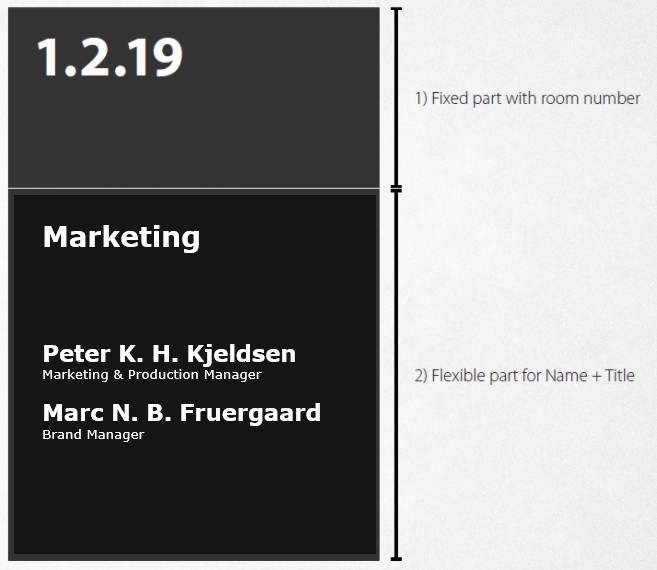
Flexible part print template
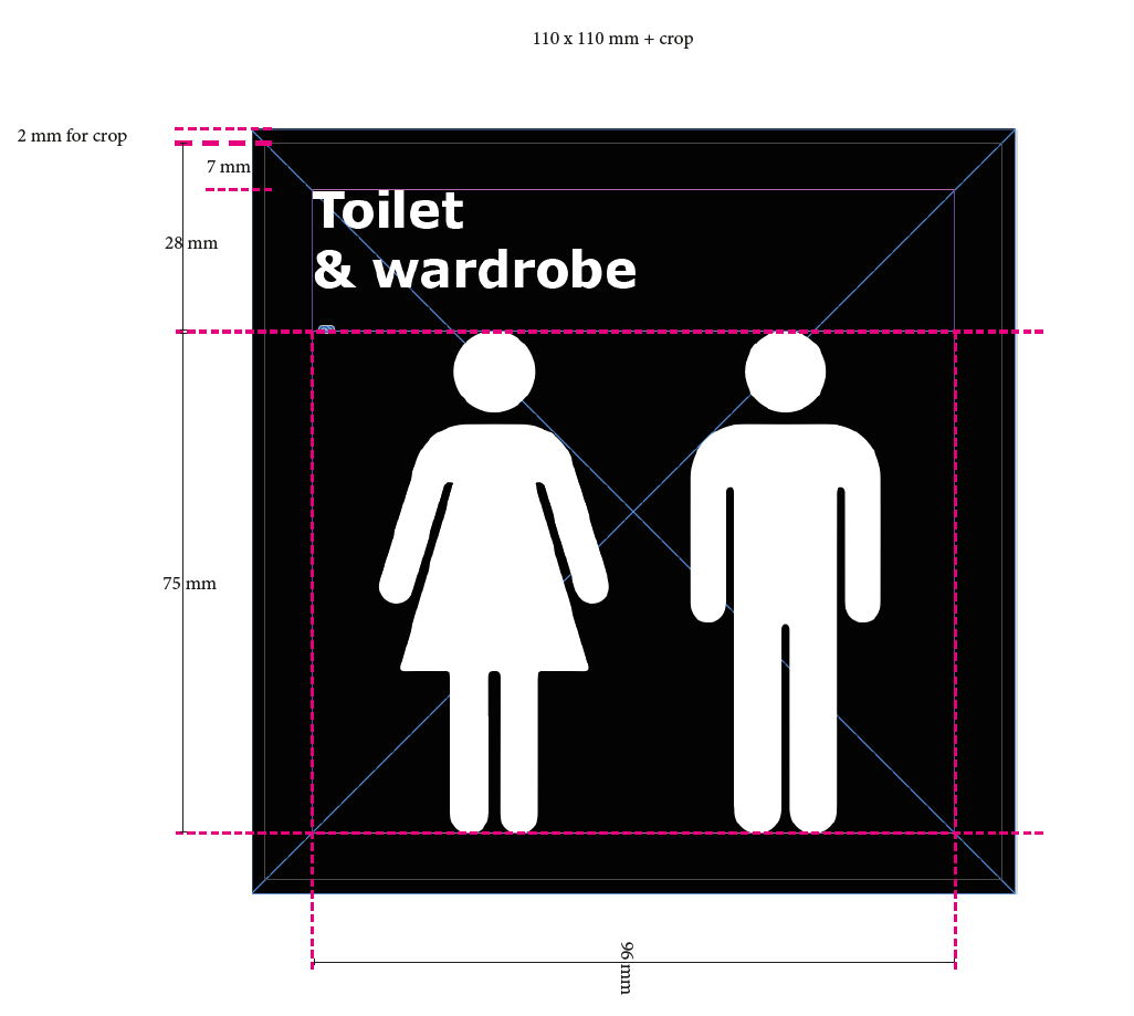
Standard signs can be found below:
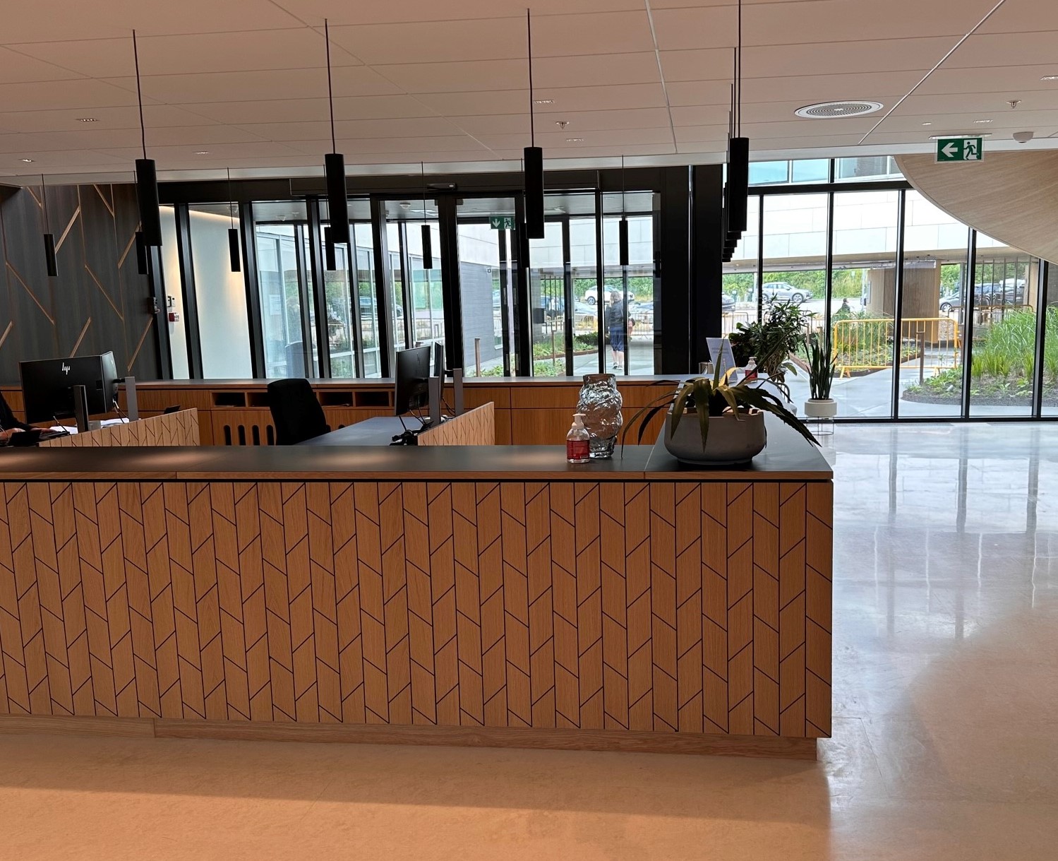
Reception
For the receptions we want a calm, inviting and scandinavian look and feel.
Other signage
We can have ad hoc needs for temporary signage in our offices. For these remember to use Verdana as the font and keep it as simple as possible. Black font on white paper. If it is more permanent signage and you are in doubt about the solution, please contact the Marketing department.
The use of JYSK logos
It can be tempting to put a JYSK logo on anything from binders to stationary to signs etc. Please don't use the logo unless its absolutely necessary or beneficial for the function of that particular item. Employer branding items is an exception to this.

