Readability and visibility
Last edited: 11/09/2018
Sometimes backgrounds, texts and pictures are not optimal for the reader to see. Therefore we have a couple of tools that helps increase the visibility.
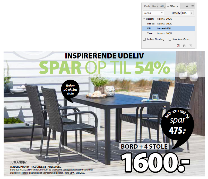
Text box with a white background
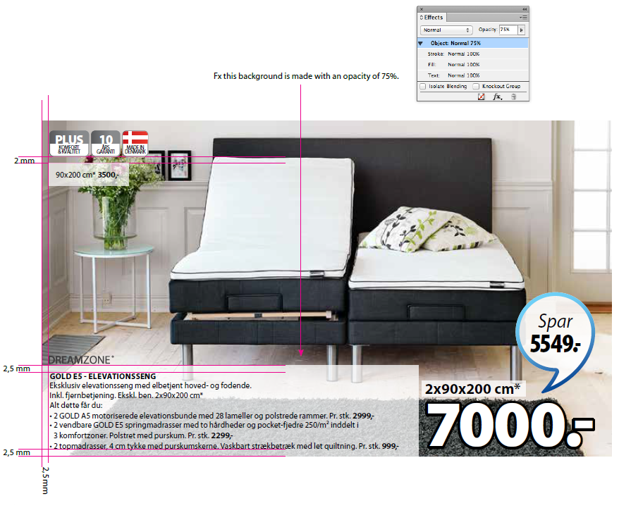
To make your text reader-friendly when placed in a photo you can use a white background behind the text with 2,5 mm space from the edge to the text. The white background must always be set to an opacity which suites the readability.
Textbox always have sharp edges.
Box with a white transparent background behind headline text
It may be necessary to place a transparent box behind headlines. The box may vary in transparency - from 10-75% white.
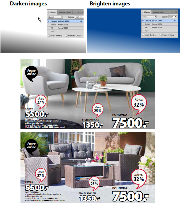
Brighten or darken images
You can brighten or darken the images so the text can be read. This can be both product text and headlines.
It is very important that it has to look NATURAL.
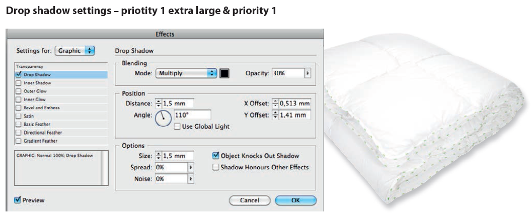
White products on white background
White products on white background should always have a drop shadow applied.

- Drop shadow settings - Priority 1 extra large & priority 1
-
- Drop shadow settings - Priority 2, priority 3 & 3 small
-

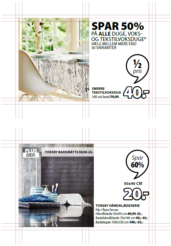
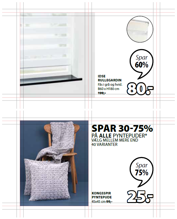
If environments can’t fill out prio
If there is not enough image to fill out the space given for the prio you have to cut off the image and use the remaining space for the text, prices, logos or whatever there can be as extra informations for a product. The remaining space should always have a white background.
- See examples
-