Savings
Last edited: 11/09/2018
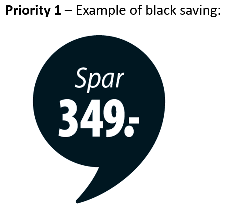
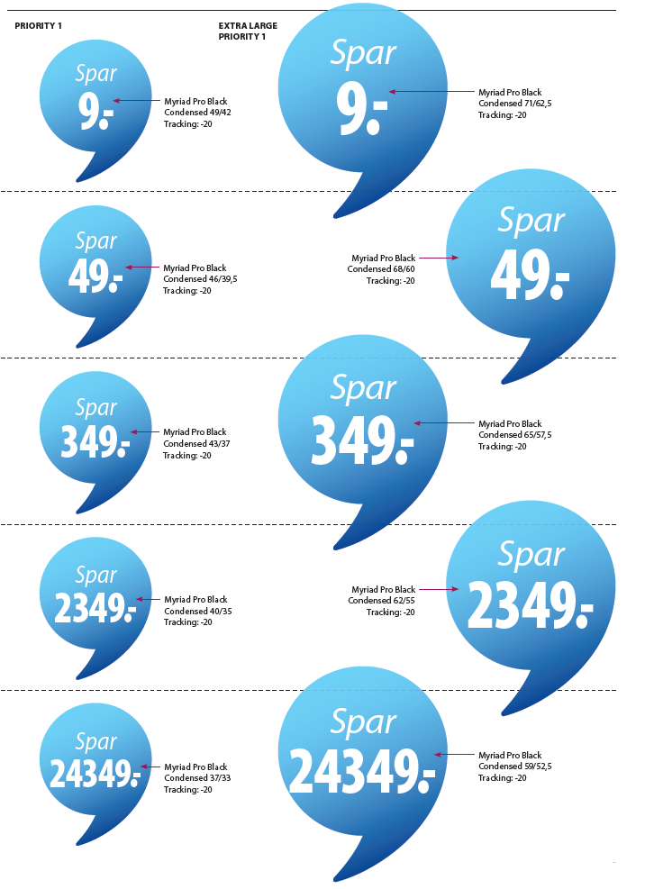
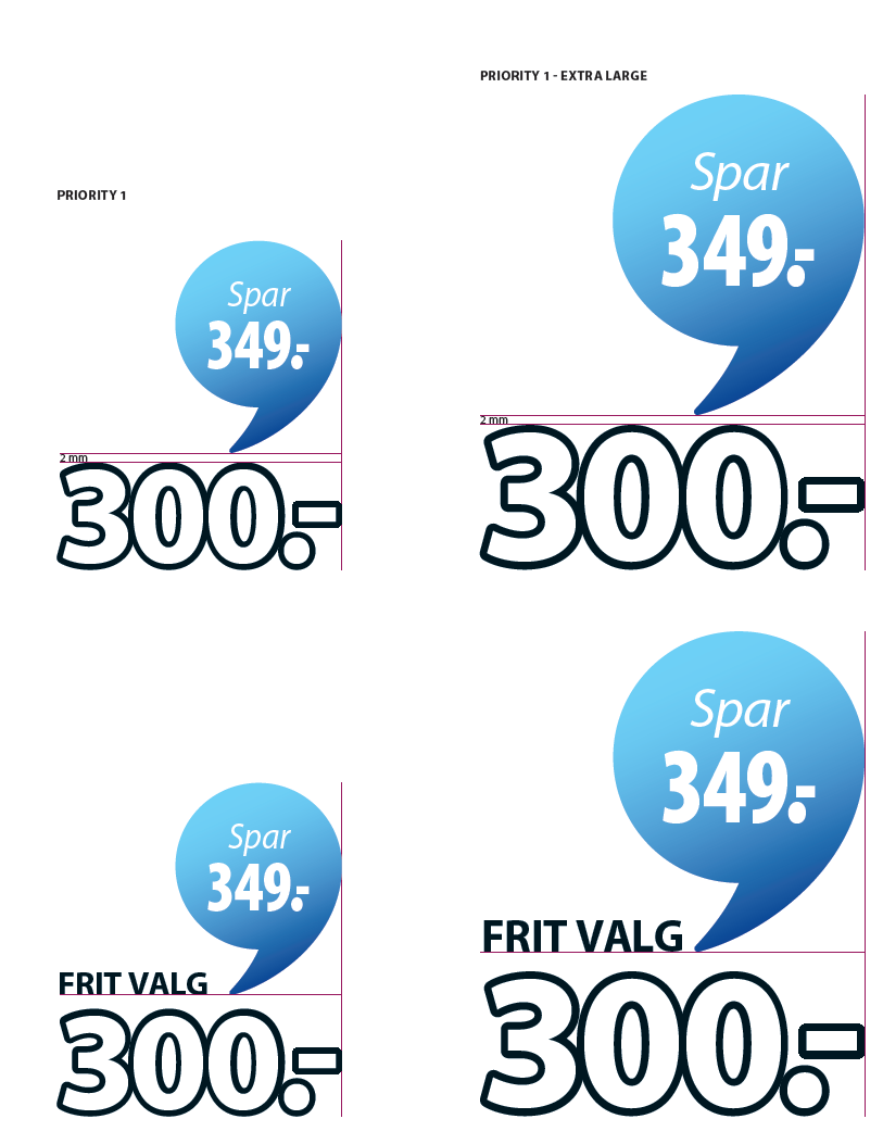
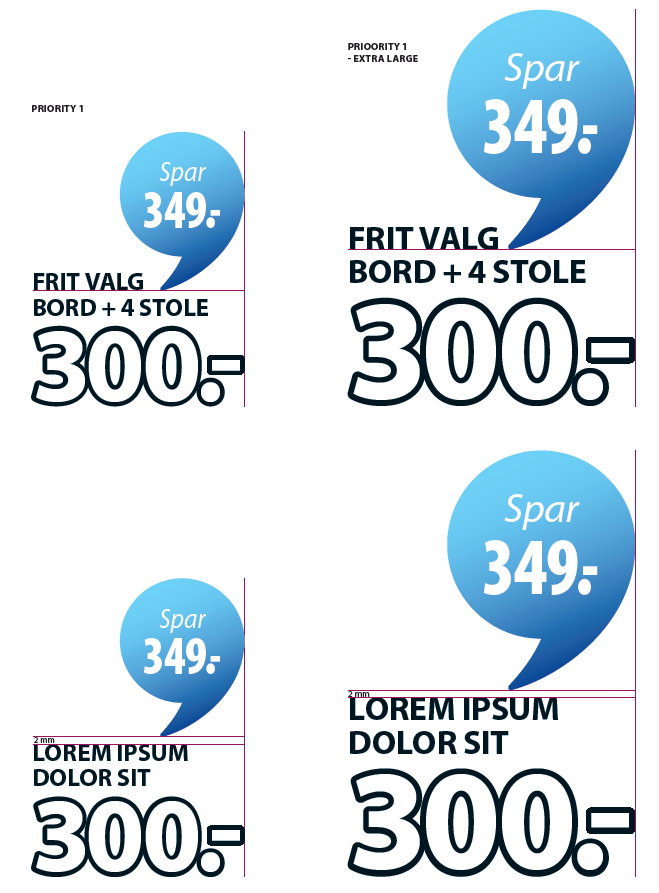
Priority 1 savings are always in full gradient campaign colour or in plain black. Plain black is primarily used when one of the other “saving” colours clash with the background.
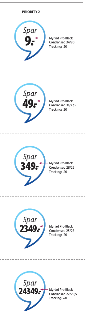
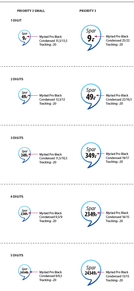
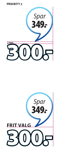
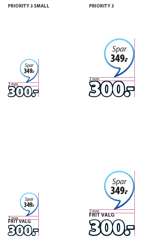
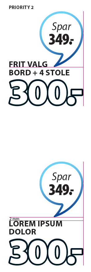
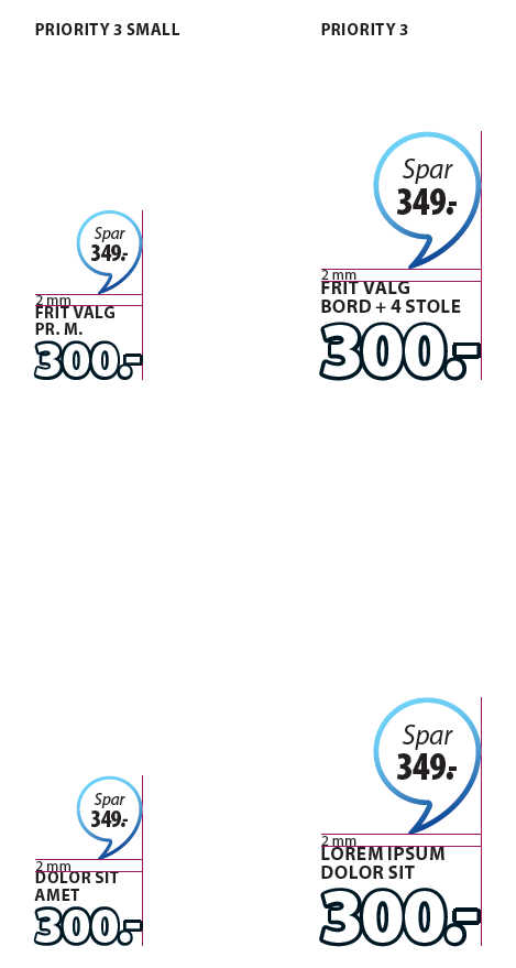
Priority 2 and 3 savings always white transparency fill with gradient campaign stroke. Always ensure that there is air between the text and the edge so the text does not go over savings.
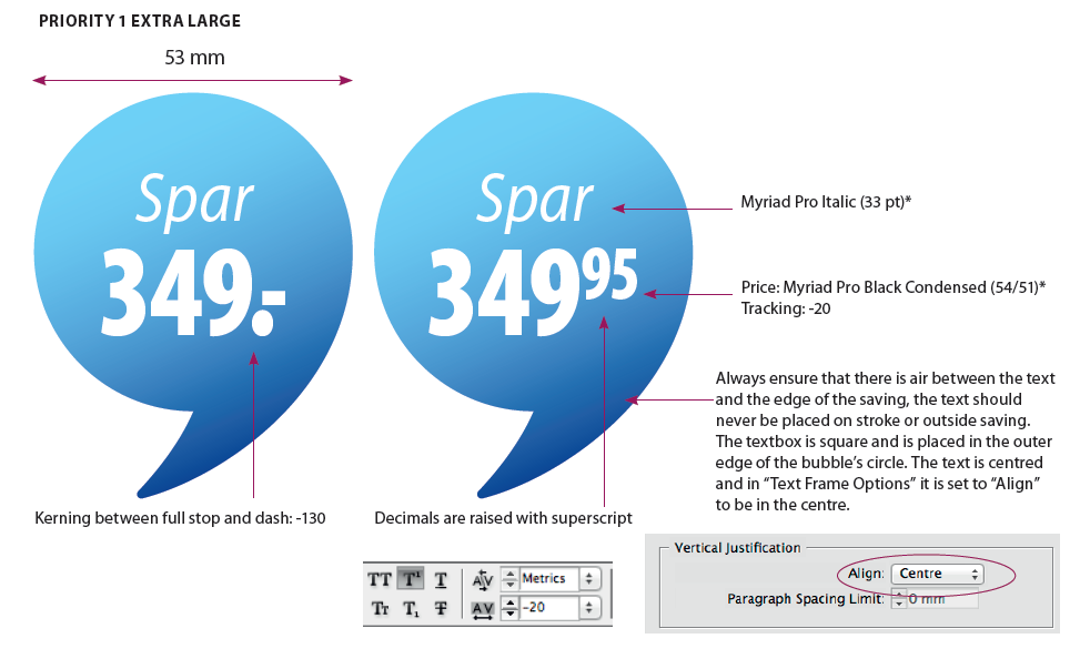
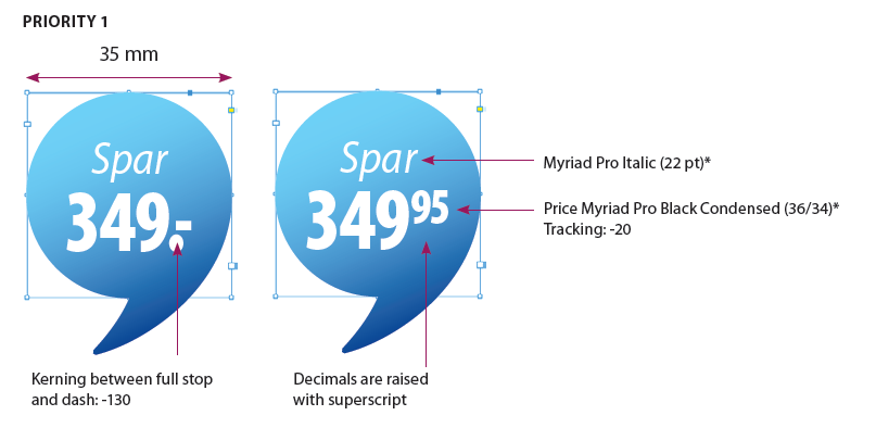
Priority 1 has to be manually changed when imported to filled campaign colour. Decimals are raised with superscript.
*NB: Font sizes written in ( ) in the examples below are guidelines. The font sizes in ( ) are meant as guidelines to ensure a uniform expression in the Savings element. For examples of how the font size can vary depending on the language - see example later in the present chapter. However, always ensure that there is air between the text and the edge of the saving, the text should never be placed on stroke or outside the saving.
- Priority 1 savings
-
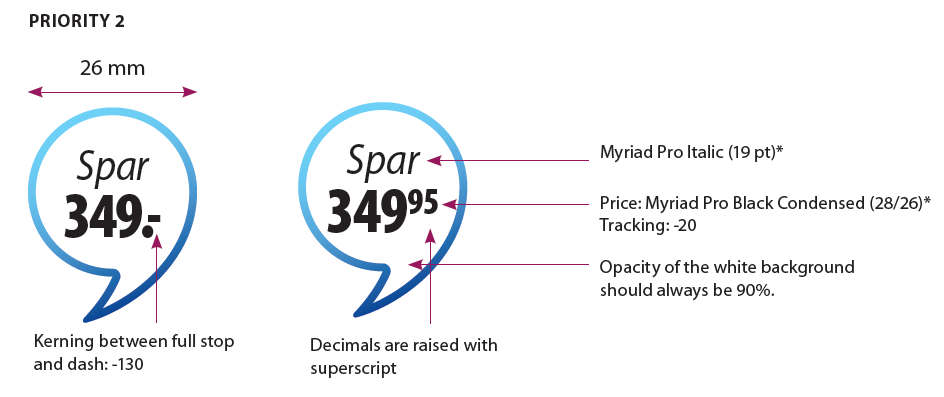
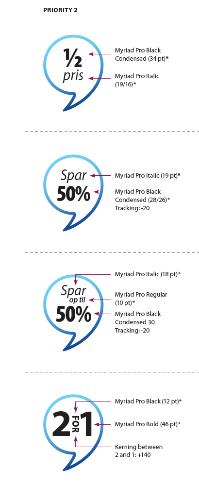
- Priority 2 savings
-
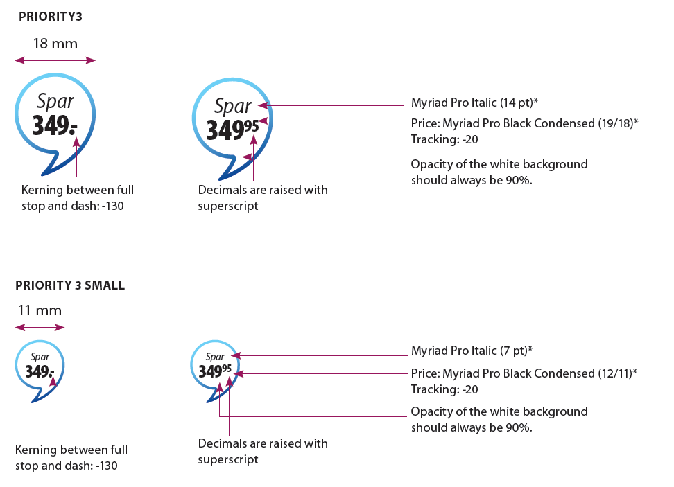
- Priority 3 savings
-
- Savings for all countries
-
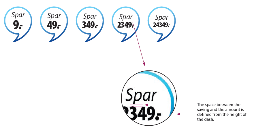
Savings and number of digits
To create air around saving and the amount, font size is lowered 3 points every extra digit in the amount. If there is one digit, the font size is 25 pt., two digits = 22 pt., three digits = 19 pt. etc. The space between the saving and the amount is defined from the height of the dash.
- Priority 1 savings and number of digits
-
- Priority 2 savings and number of digits
-
- Priority 3 savings and number of digits
-
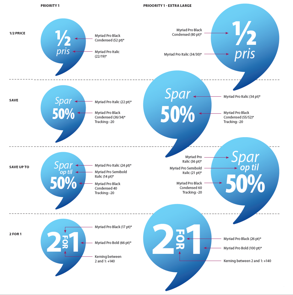
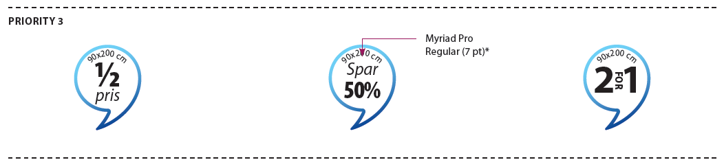
Other examples of savings
Examples of ½ price, % savings, "Save up to" and "2 for 1" savings suitable for all 5 priorities.
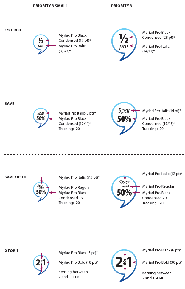
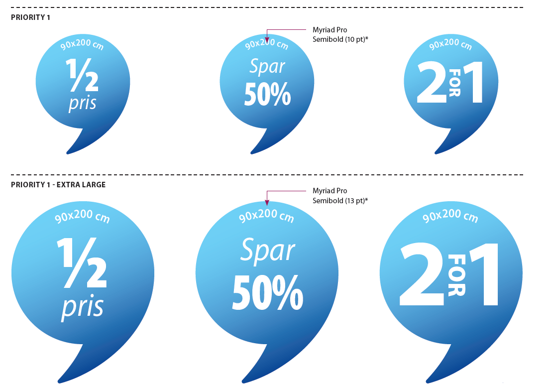
- Priority 1 other examples of savings
-
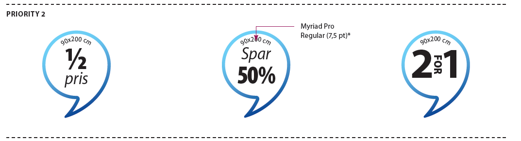
- Priority 2 other examples of savings
-
- Priority 3 other examples of savings
-
Placement of Extra Save Message
Exception - No extra save message can be used in priority 3 small
- Priority 1 extra save message
-
- Priority 2 extra save message
-
- Priority 3 extra save message
-
placement of savings
Savings should be placed 2 mm above the price, when there is no Price Info Front (PIF). If there is a “short” PIF, the saving should be aligned with the bottom of the PIF. If there is a “long” PIF, the saving is placed 2 mm above the PIF’s upper edge.
- Priority 1 placement
-
- Priority 2 placement
-
- Priority 3 placement
-
Savings and PIF (Price info front) in several lines
The PIF can sometimes be split in 2 lines. To place the saving according to this please consider:
- If there is space next to the top line in the PIF, place savings so the bottom edge is aligned with the top sentence of the PIF
- If there is not enough space for this, place the saving 2 mm above the top line. Savings is always right- aligned with the price
- Priority 1 savings and PIF in several lines
- Priority 2 savings and PIF in several lines
-
- Priority 3 savings and PIF in several lines
-
Placement of product text, PIF, price and savings sideways
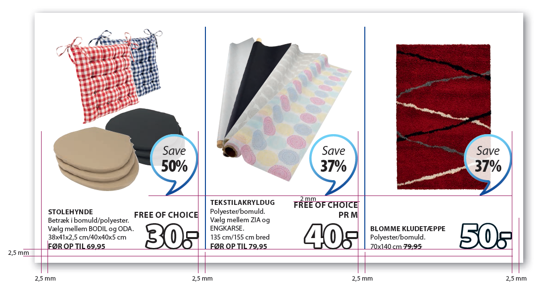
If products or offers with different information i.e. no PIF, are placed next to each other, the rule about savings being placed 2 mm above the PIF does not apply. Savings are instead alligned with the upper edge of the PIF, so they don’t move around. The PIF with the most lines will determine the placement of the saving. Producttext, prices, savings etc are placed with a distance of 2,5mm to the edge of the priority field.
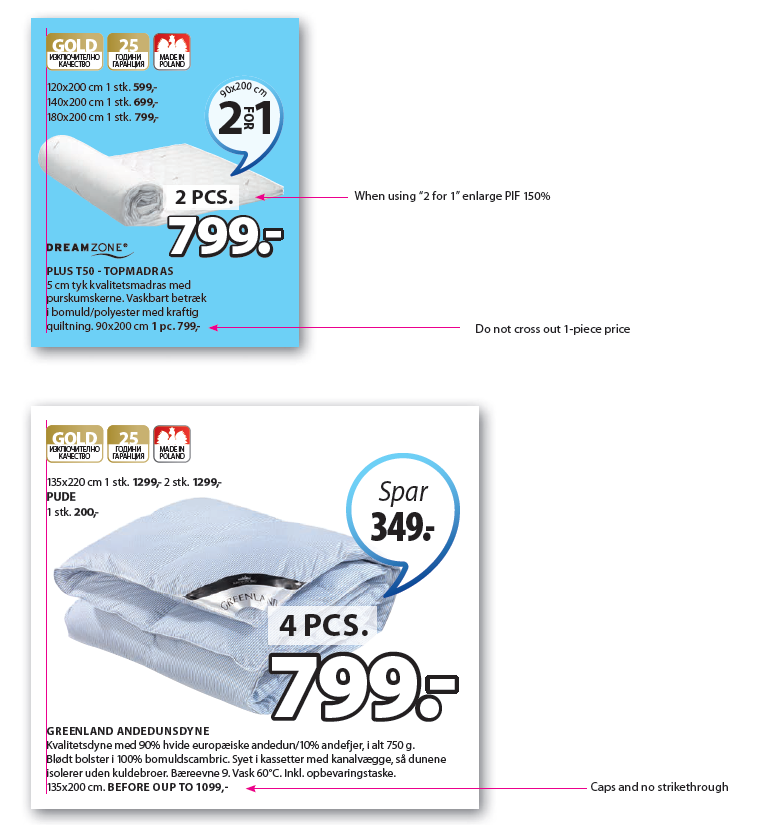
Unitized price before up to offers
When marketing unitized price offers the 1-piece price will not be crossed out in the promotion text.
When the text BEFORE UP TO has been added in front of the normal price, this normal price should not be crossed out.