Example

Colours

Last edited: 03/07/2024

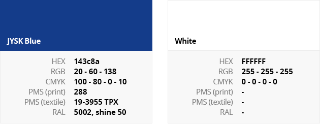
Logo Colours

The colours of the logo are defined according to the following international standards:
Example


Communication blue

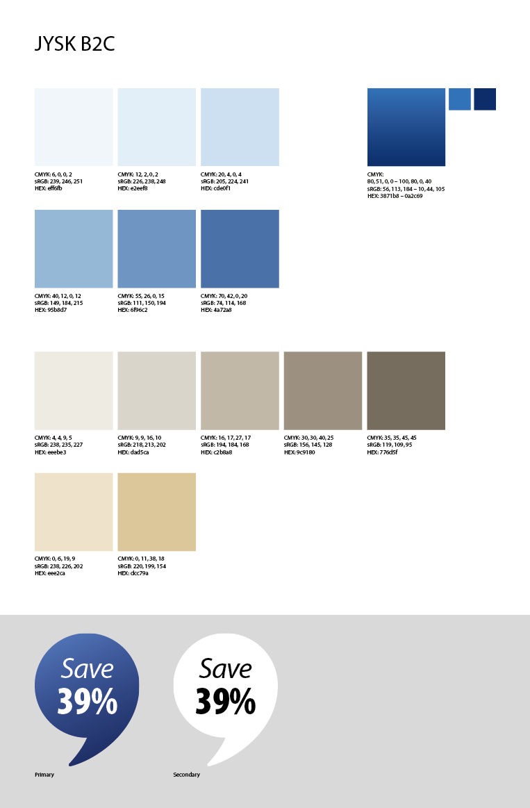
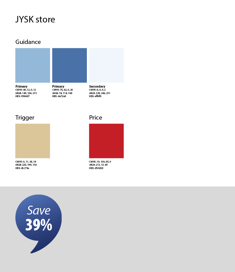
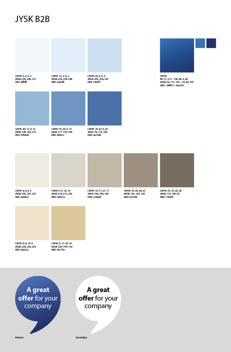
The communication blue is used in wide variety of materials, ranging from store marketing to online marketing. The colour is often used as a speech balloon with a text message in it. 

Example


Use of other Colours

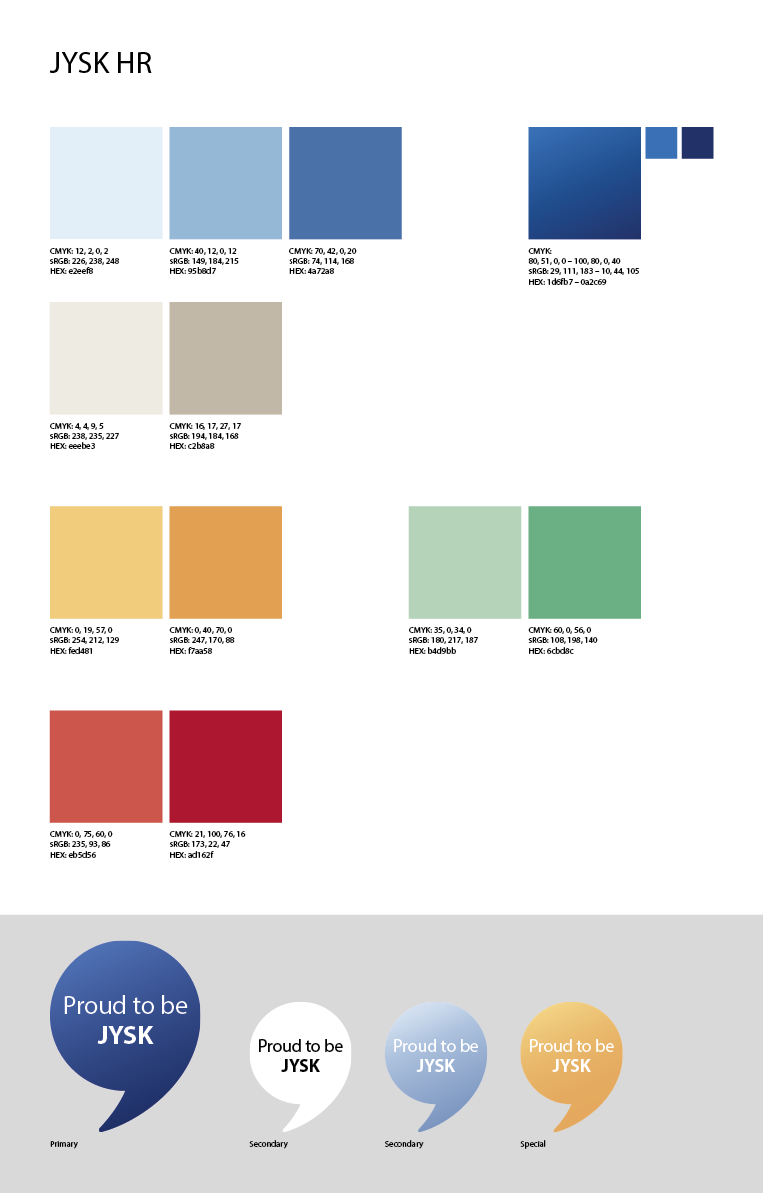
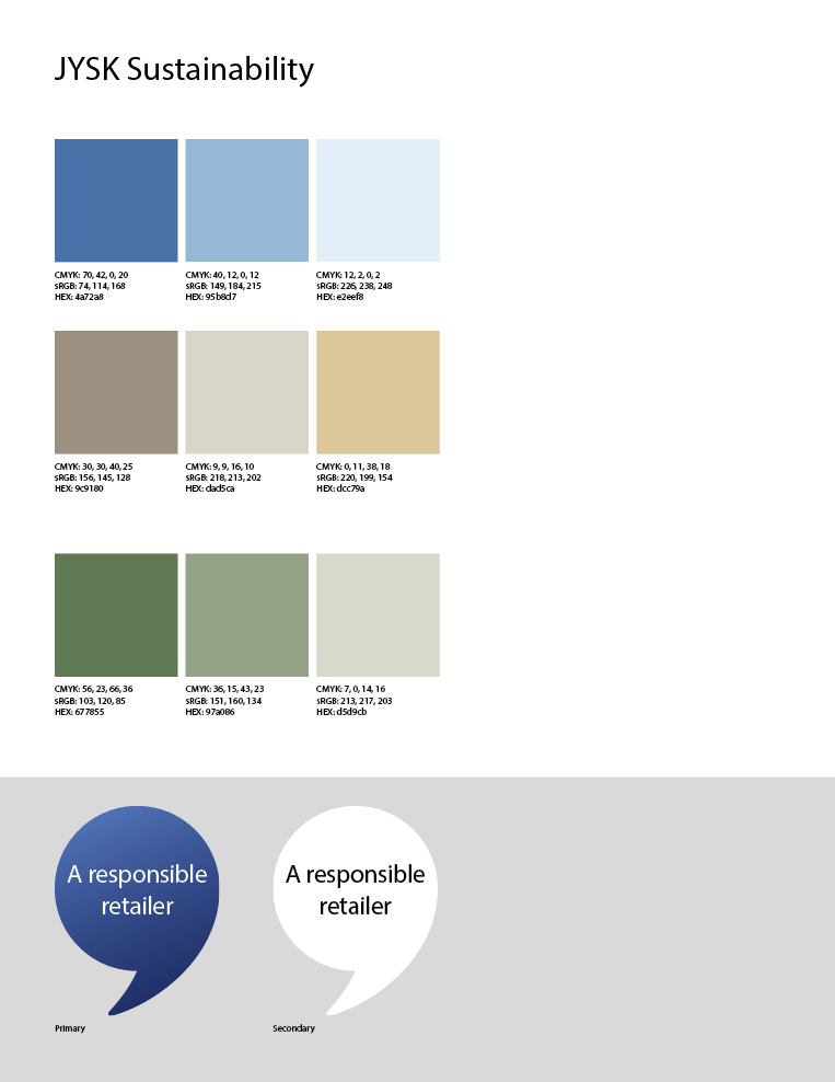
In general the colours used both externally and internally in JYSK should represent the Scandinavian identity. The colours used should be subdued as we try to keep the look as light as possible in order to obtain a Scandinavian expression.  Exceptions can be for special dynamic campaigns (e.g yellow, red etc.). In JYSK we also work with specific trend colours that change with the changing seasons. These trend colours are also used across marketing materials when relevant. If you are working on something fundamental that is exposed to customers you need to check with the Marketing department. 

Scandinavian colour examples

Example


About

JYSK is an international chain of stores with Scandinavian roots that sells everything for the home.

The first store opened in Denmark in 1979. 

 Read more

JYSK Blue Line

JYSK BLUE LINE is created in order to secure JYSK as a strong and international brand.

When following these brand guidelines, it differentiates us from competitors, increases customers’ recognition and reinforces our identity.

JYSK

JYSK
Sødalsparken 18, DK-8220 Brabrand, Denmark
Tlf.: +45 89 39 75 00
Fax: +45 89 39 75 01

For enquiries please contact Marketing department

© JYSK BLUE LINE 2024